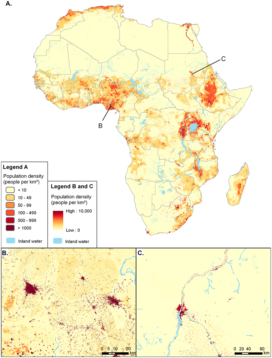
Figure 1: A map of African population density in 2010 (a) with close-ups of south-east Nigeria (b) and Khartoum (c). Figure taken unmodified from Linard et al. (2012, fig. 1). This figure was originally published in PLoS One, under a CC-BY license. The original publication is available from http://www.plosone.org/article/info%3Adoi%2F10.1371%2Fjournal.pone.0031743
[Large]