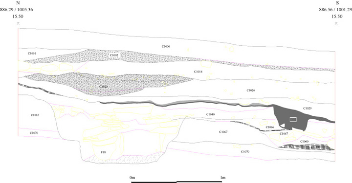
Figure 1: Example of a section drawing created in AutoDesk's AutoCAD. Excavations in advance of an oil tank (Sector 2, Intervention 26) section view from the Tarbat Discovery Programme (Carver 1998, The Settlements at Tarbat, Figure 5).
Archaeologists have been displaying rasterised vector images on the Web for years, but making them available as true vector images that are functionally comparable to the program used to create them can be problematic. It is simple to use HTML to display a raster image such as a photograph on the Web. No interaction with the image itself is expected. In some instances it may seem as if interaction with a raster image is occurring, but in reality the user is probably working with different areas of an image using an HTML overlay called an 'image map' or causing an image to change to a different image by using a JavaScript action called a 'mouseover'. The image itself is not altered (Negrino and Smith 2001, 3; Castro 2003, 130).
For a vector image, things are more complicated. The image may be created in layers that can be turned on or off, and the user controls the way elements are displayed. The ability to pan or zoom to create different views of an image without loss of resolution may be necessary in order to interpret the image. The image may reference a database and interaction with the database through the image may be the most effective way of accessing the associated data. The image may be generated by a database itself and only exists based on a user-defined query. All of these functions are beyond the capabilities of any static raster image, but are fundamental to much of the vector-based work currently undertaken in archaeology. How this functionality can be presented on the Web is a question that needs more exploration. There are a variety of solutions available, each with their own advantages and disadvantages. The fact that no consensus has developed indicates that a satisfactory solution remains elusive, and that it is time to explore the problem further (Cagle 2002, 9).
The publication of large plan and section drawings has always been problematical in archaeology, both in print and on the Web. Using vector graphics can address some of these problems, but it is important to consider the inherent differences associated with use of this technology as well. For example, a hard copy of a section drawing may be over a metre long, but once digitised into vector format it can be presented at any level of detail or in its entirety without loss of resolution, and the user can choose which areas are of interest. This is consistent with the trend towards publishing more completely in archaeology, and not just synthesising conclusions. (Livingood 1996; Clarke et al. 2003, 402). Althugh only one of many decisions archaeologists make during the analytical process, by using vector graphics in this way an author or editor would not have to pick and choose which details of an image to use, and so a layer of subjectivity may be removed.
Figure 1: Example of a section drawing created in AutoDesk's AutoCAD. Excavations in advance of
an oil tank (Sector 2, Intervention 26) section view from the Tarbat Discovery Programme (Carver 1998, The Settlements at Tarbat, Figure 5).
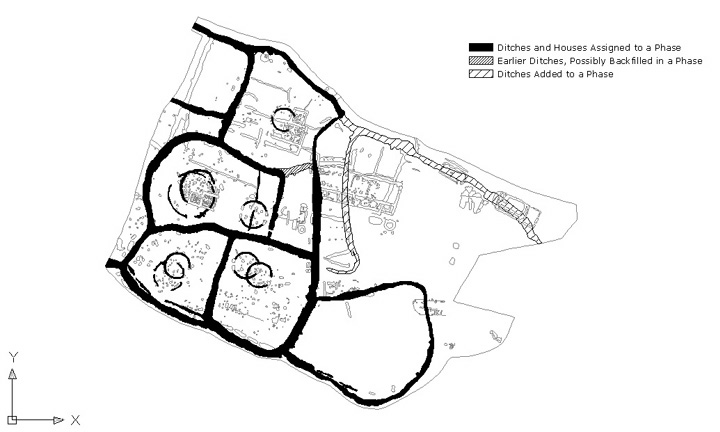
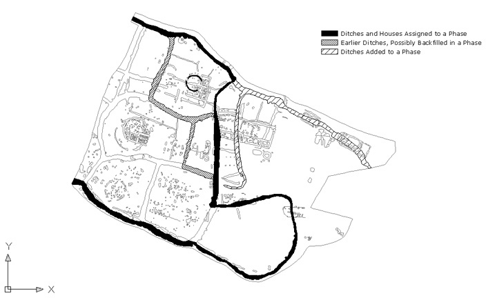
Use of layers in archaeological vector drawings can be very helpful as an aid to interpretation as well. They may help simplify a complex drawing, or highlight areas that may be of particular interest, without having to choose a detail (Judith Winters pers. comm. July 2003). Because layers can be turned on or off, the user can decide which is most important, and in what combination (Eiteljorg 1989). This again demonstrates a way that vector graphics can give more control to the user. Layers can show how a site or section is organised or how it has changed over time; but it can also illustrate the process that went into creating a drawing. In particular, this type of visualisation can be used as an important tool to help identify and communicate uncertainty in archaeological data, and provide alternative interpretations (Ryan 2002).
Computers are perceived as being more accurate than humans; therefore, digital visualisations tend to convey a sense of being more factual than images on paper. In reality, authors will frequently have to combine digital data in which they have varying degrees of confidence in order to create something that communicates the information they are trying to convey (Miller and Richards 1995, 20). If a drawing is divided into layers reflecting how conjectural the data are, it leaves the user to decide whether they are in agreement with the ideas presented by the author and makes the interpretation more transparent. Although vector graphics divided into layers may be used to show uncertainty, the way in which layers are chosen and divided is still the result of a subjective decision.
© Internet Archaeology
URL: http://intarch.ac.uk/journal/issue20/1/2.1.html
Last updated: Tue Jul 18 2006