This step will take you through the process of using ArcMap's inbuilt symbology tools to display zooarchaeological data on the template. The field 'pc' in the linked table shows the percentage of bone pieces from each anatomical part that had cut marks, and we will colour each element according to this value.
Double-click the elements layer to bring up its properties, and choose the symbology tab.
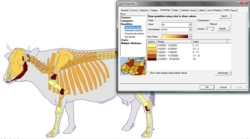
In the list on the left, select 'quantities' then 'graduated colors'.
Choose the pc field in the drop-down box marked 'value'. A series of colour-graded categories will appear in the symbol list (Fig. 1). You can change the number of categories using the 'classes' box at the right of the tab, and can also change the colour ramp used, for example to greyscale.
Figure 1: Setting the symbology options.
ArcMap assigns categories automatically based on the distribution of the data, but you will probably want to change these to more regular intervals. This can be done either by typing the desired ranges into the 'range' field on the symbol list, or by clicking the button marked 'classify' and dragging the dividers to the desired position. Note that you can also edit the labels for each category using the symbol list if, for example, you want to reduce the number of decimal places displayed when you create a legend.
When you are happy with the categories, click OK to view the results.