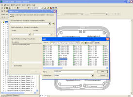
Figure 8: Adding query data to ArcMap of possible dress items at Ellingen.
To create distribution plots of these data in ArcGIS, the first step was to create maps of each site using ArcMAP, a component of ArcGIS. The 'shape' files of the buildings, excavation trenches and recorded site features, created during the digitisation of the published plans, were included as layers in each map. Then the queries generated in Access, which summarise the quantity of artefacts of each particular category in each location, were exported from Access into DBF IV (.dbf) files. The tabular summary data in these quantitative summary queries, and the XY coordinates they contained, were used to plot the data. This was done by simply adding the query data, stored as dbf files with relevant pathways (i.e. folders and directories), to the relevant GIS map as further layers (Figure 8). If the pathway of a dbf file was altered after these plots were created, for example if the DBF IV query file was moved from one folder to another, then the data would no longer be readable in GIS, and the pathway, or 'source', had to be re-established. Distribution plots of the quantities of artefacts of the various categories within each query were produced. These showed, for example, which locations or buildings particular gender groups might have frequented or where particular activities may have taken place.
Figure 8: Adding query data to ArcMap of possible dress items at Ellingen.
The distribution plots were designed using the 'Symbology' menu in the 'Properties' dialogue box of ArcGIS (Figure 9), which contains a number of formatting options for plotting such queries in GIS. Initially, several different plot types were tried, but pie charts were found to be the most effective style for visual display and for the analyses of artefact distribution and density. In particular, the diameters of all the pie charts could be scaled according to the number of artefacts in each location and then all plotted at the same scale. Thus, the pie charts allowed the distribution and the relative quantity, or density, of artefacts of several different categories within a particular query to be visualised simultaneously (Figure 10). This was a useful means of displaying and analysing general distribution patterns, the details of which could then be investigated by, for example, generating plots of individual categories (e.g. of only women and children, or of only a certain building phase).
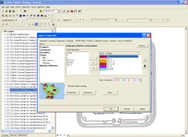
Figure 9: Symbology function in ArcMap of possible dress items at Ellingen.
The more detailed distribution of artefacts within specific buildings, or rooms, can also be investigated by zooming into desired parts of the GIS maps. However, because of the system of mid-points, which was required for many provenances, data plotted to a single point sometimes represents a summary of the artefacts found in a potentially large area of the site (e.g. an entire trench, or more than one building). This was taken into account when analysing these distributions.
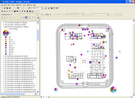
Figure 10: Formatted plot in ArcMap for possible dress items at Ellingen.
© Internet Archaeology/Author(s)
URL: http://intarch.ac.uk/journal/issue24/6/2.4.html
Last updated: Mon Jun 30 2008