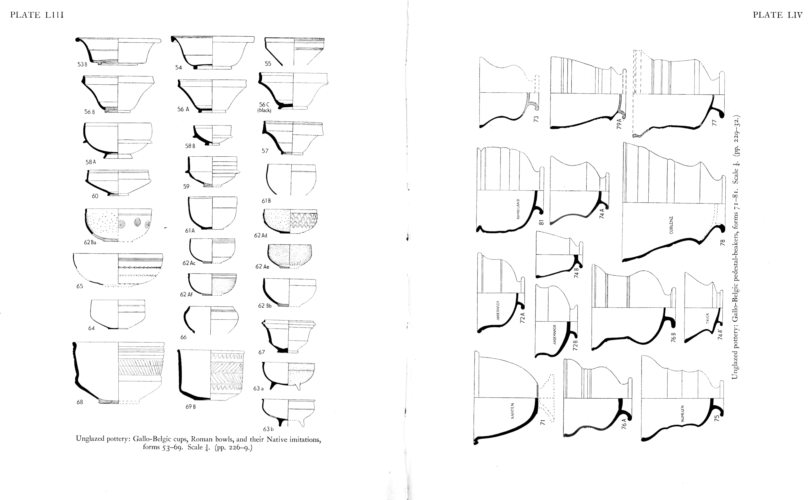
Figure 1: One of the scanned pages of the Camulodunum series (after Hawkes and Hull 1947, plates 53-54), from which the standardised pot diagrams are extracted.
Figure 2: Examples of the segmented images (bottom row) of vessels obtained from the original extracted images (top row). In the segmented images, black pixels lie outside the vessel, light grey pixels are the vessel itself, white are the interior of the main chamber, and dark grey are any other interior pixels.
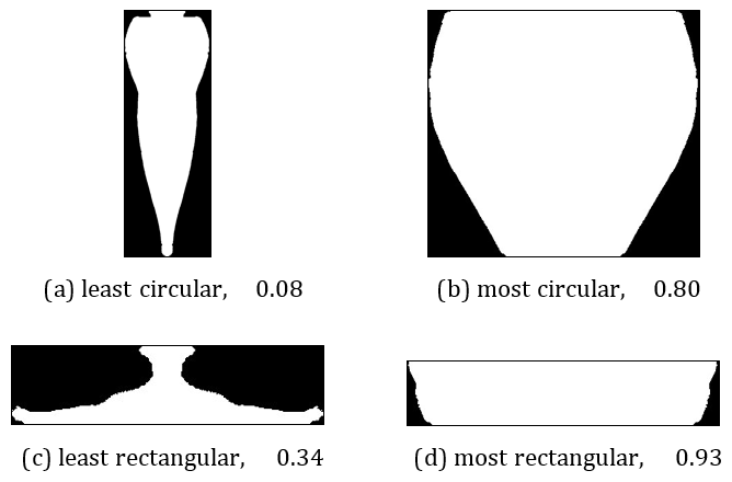
Figure 3: Images of the least and most circular and rectangular pottery vessels.
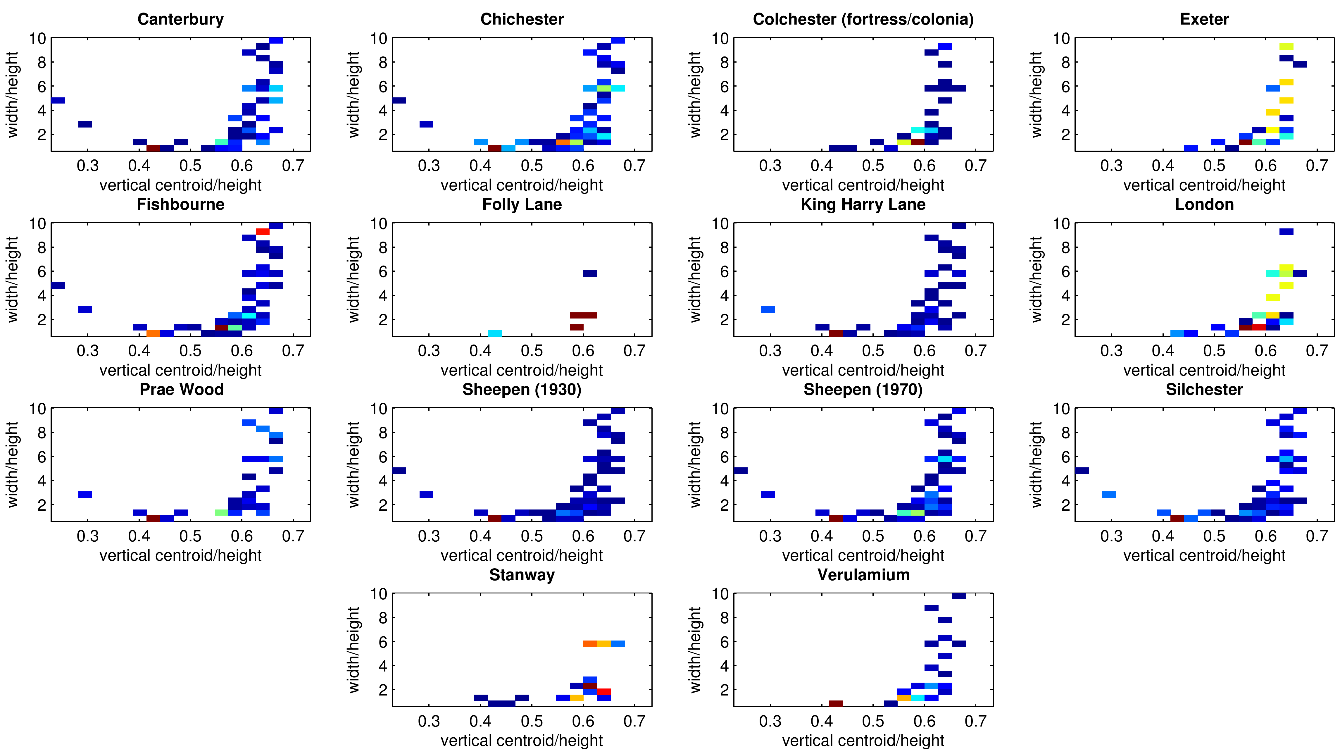
Figure 4: For each site in this set, histograms display the quantity of vessels by the proportion of vertical centroid to overall height.
Figure 5: 2D histogram comparisons: quantities of pottery vessels, by centroid height proportion and the proportion of width to height. The colour scale ranges from blue (low) to red (high); white represents zero finds in that range. By eye it is slightly difficult to compare these histograms; Figure 6 shows the same histograms, but smoothed (using a Gaussian filter), which makes it much easier to see similarities and differences.
Figure 6: 2D histogram comparisons: centroid/height vs width/height. Based on the original histograms shown in Figure 5, these are the smoothed (using a Gaussian filter) versions.
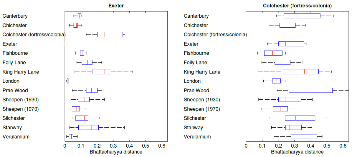
Figure 7: Boxplots comparing the Bhattacharyya distances between the 1D histograms for all measures individually, for Exeter (left) and Colchester (right). In each box, the vertical red line marks the median, the horizontal limits of the box mark the 25th and 75th percentiles, and the whiskers extend to the most extreme points that are not considered to be outliers. For clarity, the few outliers have not been plotted.
Figure 8: A plot of outer circularity versus width/height ratio, where each point is represented by the cross-section outline of the pot so that we can see how the shape varies across the group.
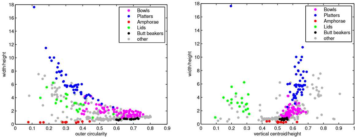
Figure 9: Plots of two different pairs of measures. Each point represents a pot, coloured according to the form groups shown in the legends. Note how the pots in the different form groups cluster together. For other selections of form groups, e.g. bowls, cups and beakers, the clusters overlap significantly, with no clear distinction between the types.
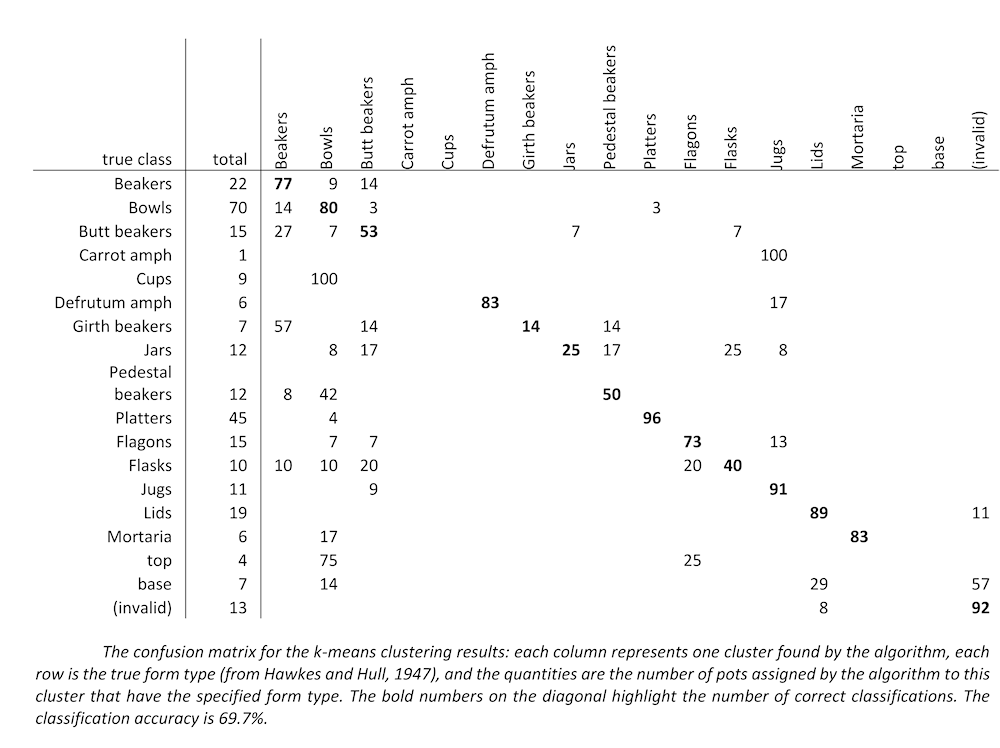
Figure 10: The confusion matrix for the k-means clustering results: each column represents one cluster found by the algorithm, each row is the true form type (from Hawkes and Hull 1947), and the quantities are the number of pots assigned by the algorithm to this cluster that have the specified form type. The bold numbers on the diagonal highlight the number of correct classifications. The classification accuracy is 69.7%.
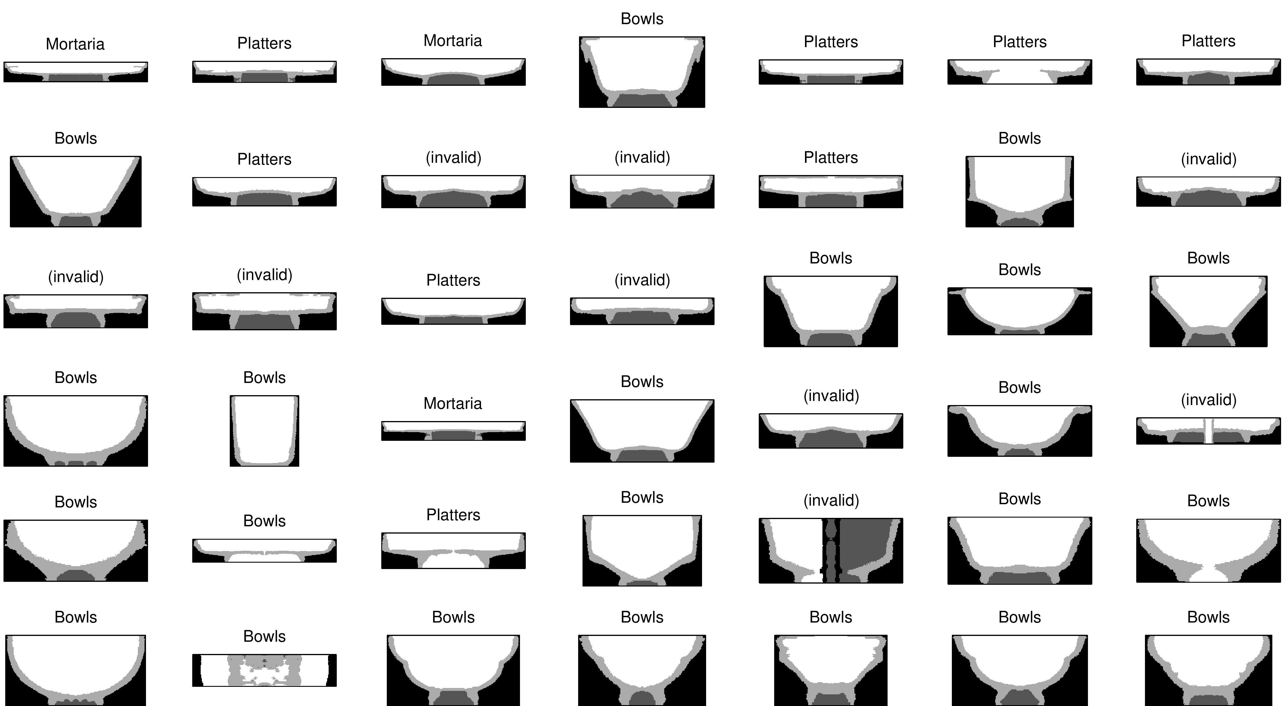
Figure 11: The pot diagrams extracted from Hawkes and Hull (1947, plates 39-40), with their segmented images and the classifications assigned to them by their proximity to the cluster centroids identified by the k-means algorithm.
Internet Archaeology is an open access journal based in the Department of Archaeology, University of York. Except where otherwise noted, content from this work may be used under the terms of the Creative Commons Attribution 3.0 (CC BY) Unported licence, which permits unrestricted use, distribution, and reproduction in any medium, provided that attribution to the author(s), the title of the work, the Internet Archaeology journal and the relevant URL/DOI are given.
Terms and Conditions | Legal Statements | Privacy Policy | Cookies Policy | Citing Internet Archaeology
Internet Archaeology content is preserved for the long term with the Archaeology Data Service (ROR). Help sustain and support open access publication by donating to our Open Access Archaeology Fund.