Cite this as: Tenzer, M. 2022 Tweets in the Peak: Twitter Analysis - the impact of Covid-19 on cultural landscapes, Internet Archaeology 59. https://doi.org/10.11141/ia.59.6
If the Covid-19 pandemic changed one thing in particular, it was how people interacted, socialised, and generally behaved as a society. Terms such as 'lockdown’ and 'social distancing’ were introduced into the everyday language - the former even being chosen as one of the Word(s) of the Year 2020 (Oxford Languages 2022b). This selection not only signifies the considerable impact of the pandemic on societal and individual behaviour, it also stands in stark contrast to the Word of the Year 2015: 😂 (Oxford Languages 2022a). The Peak District National Park was one area where this change was felt. The rich and diverse 'cultural landscape’ of the national park afforded qualities and opportunities for everyone during various levels of restrictions - from offering places for socially distanced exercise or remote places for relaxation, to vibrant villages for socialising and historical places for intellectual development. The term 'cultural landscape’ was coined by UNESCO in 1972, defining a category for World Heritage as an opportunity to bridge the divide between natural and cultural heritage (UNESCO 1972; 1992; 1997; 2021; n.d.). Never has the diversity and quality of local places been more important than during 'stay local’ orders issued during the pandemic.
The change in society also impacted the way academic research had to be conducted and the choice of approaches, methods, and tools safe and appropriate for research in various fields, such as sociology, geography, psychology and the humanities. Qualitative research methods usually applied in these subjects include ethnographic research methods, such as face-to-face interviews, focus groups, participant observation, group work on-site - methods that had one thing in common: personal contact between the researcher and the participants (Low 2002; Madgin and Lesh 2021; Taplin et al. 2002; University of Stirling n.d.). Starting research based on such ethnographic methods in 2020 challenged researchers in several ways; for example, ethics and practicalities of methods. In order to adhere to governmental regulations and provide an environment for safe and socially distanced data collection, methods had to be redesigned and extended to remote and passive options.
However, this challenge was not just seen as a stopgap to overcome the challenges of the pandemic and then return to the commonly used methods. This unprecedented time offered new pathways to interrogating and collecting qualitative data, and developments in IT and computational capabilities mitigate the disadvantage of the restrictions on social contact to a certain degree. Furthermore, a variety of social media platforms are currently used by billions of people across the globe producing vast amounts of qualitative data on everyday topics and trends. Facebook, Instagram, YouTube, Snapchat, WhatsApp, WeChat (China), TikTok, and Reddit are just some of the most prominent players in the world of social media. These online platforms offer ways to build communities of special interest groups and connect individuals to people and places - especially in times of restrictions on movement and socialising. Social media research also offers a way to explore trends and sentiments in society, which is, for example, used by academic researchers (Bertrand et al. 2013; Pulido et al. 2018) and governmental organisations (Social Media Research Group 2016).
From the view of heritage management, tapping into the treasure trove of social media as one 'socially distanced’ method for research allows exploring people’s behaviour, sentiment, and connection to heritage places in particular. While physical visits to museums, archaeological sites, landmarks, and travel, in general, were not possible during the most severe lockdown restriction periods in 2020, many organisations and institutions searched for new ways to connect to people. Virtual museum visits (Bianchini 2021; Gutowski and Kłos-Adamkiewicz 2020; Samaroudi et al. 2020) and outreach through social media, such as the Twitter channel of Chatsworth House or the British Museum, with over 2 million followers, became a new form of cultural experiences, replacing the 'real thing’ and physical museum visits. Lockdown rules in 2020 varied between a full lockdown, including a 'stay at home’ order from 26 March, transitioning into a phase of gradual lifting of measures from 10 May (Institute for Government Analysis 2021). This easing of restrictions gave people more freedom of movement and a slow return to the 'new normal’, including, for example, pre-booked access to venues of English Heritage and the National Trust adhering to social distancing rules and tightly controlled visitor numbers. How did lockdown and restrictions on movement influence people’s behaviour and emotional state? The positive and negative impact of such regulations was explored by a team of researchers at the University of Cambridge (Jones and McGinlay 2020). The method applied in that project was based on an online questionnaire. On the one hand, the report concluded that the Peak District National Park residents enjoyed the quieter periods with lower visitor numbers, leaving more space for the residents. On the other hand, businesses suffered from the decreasing visitor numbers and at the same time, an increase in 'irresponsible behaviour from other users of the Peak District National Park during lockdown’ (Jones and McGinlay 2020, 12).
This project further explores the issues and opportunities associated with the pandemic and the impact of changing visitor behaviour on Peak District National Park residents as expressed through Twitter. Tweets covering the period of a full lockdown to the easing of restrictions with a 'stay local’ order (Spring Bank Holiday weekend in 2020) provide valuable insights into the public’s emotions and behaviour during the strictest Covid restrictions in a typical UK tourist destination. These data are compared to the same bank holiday weekends in 2019 before the pandemic and in 2021, introducing a post-pandemic phase. The tools used and developed in this project focus on Twitter as the primary data source. Part one of this article presents a standard set of analyses performed on the data, which is widely used in social media research, including a keyword search, hashtag and keyword analysis, focusing on sentiment analysis. To provide a deeper insight into the place attachment of people during the pandemic associated with the Peak District National Park, this typical set of social media analyses was extended by new methods of automating the qualitative data analysis in unstructured texts and the entity recognition and extraction process of geospatial information to allow the mapping and visual representation of place information in part two. This article will give an overview of the methods used, present the result of the small-scale study, introduce the automated process of extracting and spatially locating entities in unstructured qualitative data, and give an outlook on the opportunities provided by social media research going forward.
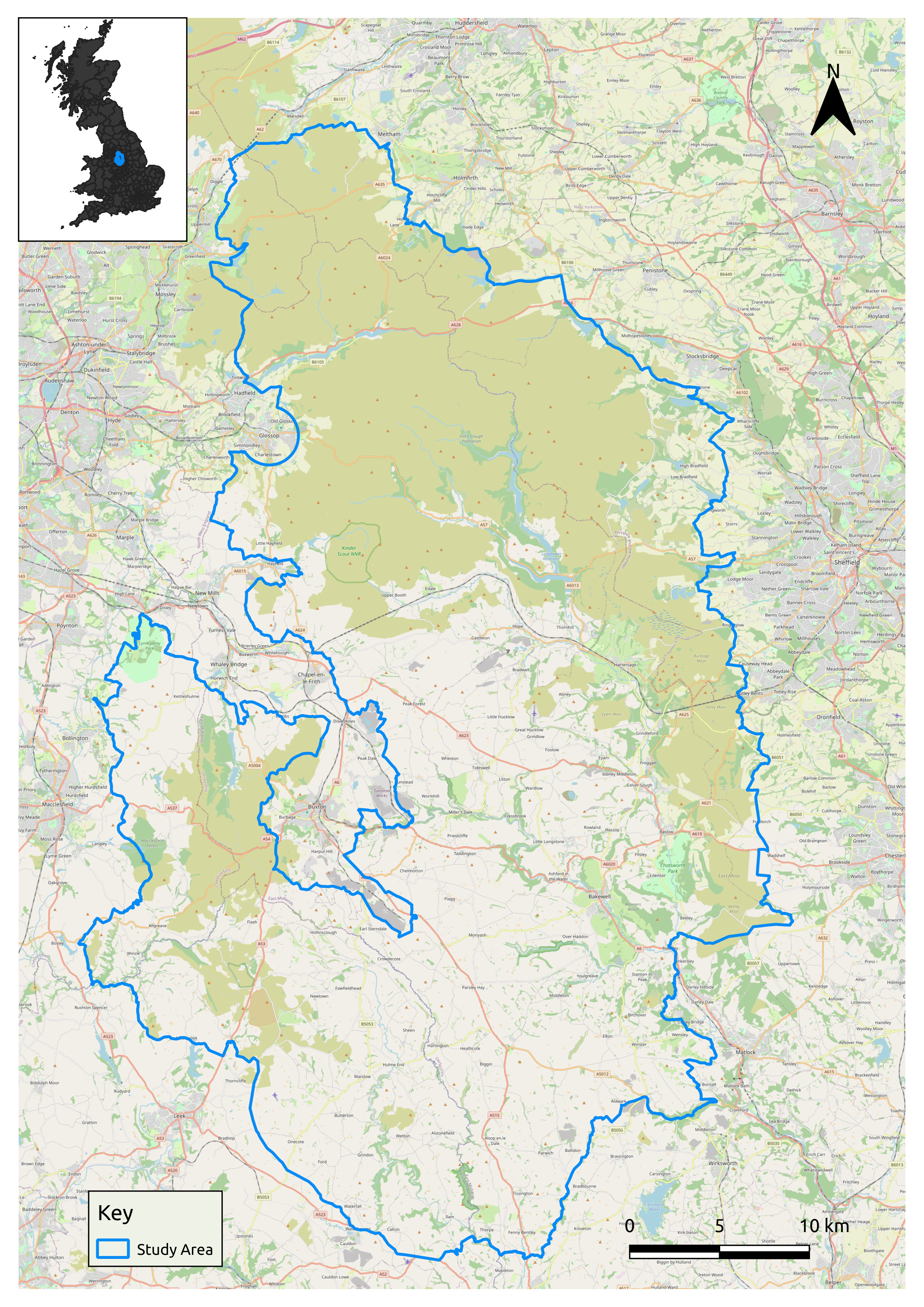
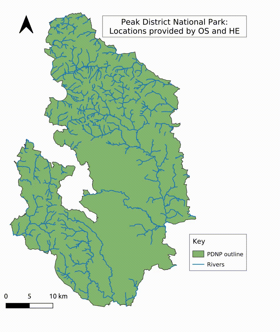
The Peak District National Park (Figure 1) is opportune as a study area for the impact of short-term and day visitors, located as it is within reach of large cities such as Manchester, Sheffield, Leeds, Stoke-on-Trent and Nottingham. Established as the first National Park in the UK in 1951 and location of the famous Kinder Mass Trespass on 24 April 1932, claiming the right of walkers to roam the countryside, the park is an ideal destination to enjoy the views, fresh air, space, rolling hills and vast moorlands. The cultural landscape of the Peak District National Park combines a rich history with areas of natural beauty and idyllic 'chocolate box’ villages. Covering an area of 1438km² (555 miles²) and a population of approximately 38,000 residents, the National Park offers secluded places for relaxation, but the varying landscape equally attracts walkers, cyclists, climbers, and photographers (Barnatt and Penny 2004; PDNPA n.d.). The highest point is Kinder Scout, at 636m. Usually, 13 million people visit the National Park in any one year. At the time of writing, the Peak District National Park had 2900 listed buildings, 109 conservation areas and over 450 scheduled monuments.
One of the factors influencing people’s outdoor and travel behaviour, apart from the restrictions resulting from the Covid pandemic, may be weather conditions. The weather over the respective weekends varied from cooler and wetter conditions in 2019 (MetOffice 2019) to the sunniest and warmest May on record in 2020 (MetOffice 2020), and mixed conditions on the weekend during 2021, with a significant rise in temperatures in contrast to the first part of May (Farrow 2021).
The wide range of social media platforms offers a treasure trove of information and insights into people’s behaviour and sentiment. Accessibility and open-source algorithms for analysis are two reasons why academic researchers and government departments (Social Media Research Group 2016) are using this resource to identify trends, gauging people’s sentiments and public opinion for public benefit and policy making. Social media platforms vary significantly in their user numbers and structure. As of February 2022, there are 57.6 million social media users in the UK (84.3% of the population). Statistics from 2021 show, for example, that Facebook had 2895 million subscribers, Instagram 1393 million and Twitter 436 million monthly users and 192 million daily users (Twitter IR 2021, 2). Twitter ranks sixth in the statistic of most used social media platforms in the UK as of 2020. The users are represented by 43% of households with an income up to £14,000, slightly rising to 60% in households with an income over £48,000 with a slightly rising representation from lowest to highest income in the UK as statistics from 2018 show. Twitter, with Facebook, has been found to be the most frequented platform for information on Covid-19 with 12%, based on a survey conducted in 2020 by the Reuters Institute in cooperation with the University of Oxford. As of 2020 data, more than 58.5% of Twitter users were male compared to 41.5% female users. A survey from 2018 among 1000 interviewees showed that over the last three months of the survey 33% of Twitter users were 15-24 years old, while 51% were 35 years and older. Urban areas were represented by 50% of Twitter users as compared to 37% living in rural areas in the UK, as found by a survey in 2018. The access restrictions, terms of reuse and privacy regulations of social media platforms vary significantly. For example, private and friend groups dominate the closed structure on Facebook, which makes it more difficult for independent researchers to access the information. Furthermore, access to Facebook and Instagram data, included in the newly formed Meta umbrella organisation (Meta 2021), seriously suffered from the Cambridge Analytica scandal in 2016. Nowadays, Meta offers only limited opportunities for independent researchers based on pre-prepared datasets provided by the Meta AD Library and similar pre-prepared statistical data sources (Meta 2022), which led to several issues for researchers (Benesch 2021; Edelson and McCoy 2021; Gibney 2019; Hegelich 2020; Linebaugh and Knutson 2021; Vincent 2021). In contrast, Twitter introduced the 'Academic Research Product Track’ in 2021, allowing researchers extended access to Twitter data (Tornes 2021). This research track offers wider research opportunities through the new v2 API endpoints with a historical search option reaching back to the beginning of Twitter in 2006 (Tornes 2021). The academictwitteR package, released in April 2021 (Barrie 2022; Barrie and Chun-ting Ho 2021) was used in this research to collect and store tweets.
As study periods, the Spring Bank Holiday weekends from Friday to the Bank Holiday Monday of the years 2019 to 2021 were defined as detailed below:
The three weekends were identified to compare the behaviour, preferred destinations, and sentiments of Twitter users as presented through their tweets. The picture painted on these platforms is limited by individual discretion and personal decisions about content. Nevertheless, the data provided allow valuable insight into people’s perceptions, emotional state, and current trends.
In a first step, familiarisation with the tweet content is crucial for understanding the outputs of the analysis and signposting inefficient and imprecise search queries and issues in the data. It is, therefore, inevitable to manually assess a large chunk of tweets in an initial assessment process. During this process, it became obvious that, for example, the weather station in Whaley Bridge produced a large amount of weather-related posts that produced an additional data load with non-essential information for this research. However, one pitfall of setting too many and too narrow search terms is the potential creation of blind spots that omit valuable information owing to one aspect being excluded from the search query. The decision to make the search as broad and open as possible favoured a reduction of search terms, keeping exclusions to a minimum.
An initial observation of the unstructured texts limited to 280 characters in single tweets showed several components commonly used in tweets: hashtags, emojis, URLs, @ Twitter handles, and other special characters embedded in the textual information. Important for the analysis of unstructured, free tweet content was, therefore, the preparation (extracting several components) and cleaning of the original text (eliminating special characters, white spaces, numbers, and reverting the text to lower case). This preparation enabled interrogation of the data, using Natural Language Processing (NLP), the application of analysis algorithms for hashtag and word frequencies, emoji and word sentiments, and a focus on location information of users and places mentioned in tweets. The following will elaborate on the various analyses performed on the dataset.
The Twitter search yielded datasets of 554, 759, and 698 tweets in the respective periods. The search query contained only three hashtag search key terms (for full search query, see Appendix) to maximise the data collected for the time period: '#peakdistrict’, '#PeakDistrictNationalPark’, '#peakdistrictwalks’. Retweets, adverts, and keywords prominent in the tweet stream, for example, '@WhaleyChronicle’, '@weatherwhaley’, '#WeAreWorkingForYou’ were excluded from the search.
Hashtags are commonly used across social media platforms to create groups of specific interests summarised by a key term in the form of the # sign and an expression in a continuous character string. Hashtags give an insight into interests and trending topics. The hashtag was invented in 2007 and has ever since been an essential part of social media (Messina n.d.; Panko 2017).
One step of the standard data processing in social media research is the analysis of hashtags. For this research, hashtags were extracted from the main dataset to understand the frequency of hashtags used and their conjunction with the search query’s key terms (hashtags) and other hashtags. One focus in this part of the analysis lay in the shift in trends apparent from newly created hashtags at certain times, which would not appear in other years. Another focus was on the frequency of hashtags associated with specific locations.
For the keyword analysis, word frequencies and word associations were analysed to define areas of interest grounded in the data provided by the tweet content. Word frequencies were explored as a means of defining the trends and highlighting issues apparent from the daily communication of Twitter users at specific times. Word correlation allowed an insight into the connection between various terms emerging from the word frequency analysis. Words featuring high in the word frequency list, for example, 'views’, 'place’, 'honeypot’, and 'landscape’, were further explored to identify the specific trends associated at the time of the investigation. Furthermore, terms of specific relevance for this study, for example, 'monument’, 'history’, and 'heritage’, were used for a statistical association analysis. This routine (findAssocs - find associations) is part of the Text Mining Package 'tm’ in R (RDocumentation n.d.). The function findAssocs provides an algorithm that consists of two steps. In a first step collocations are assessed and only tweets containing the given word are returned and further analysed. In the next step a correlation threshold will be defined. The correlation score is calculated from the relative number of collocations, where a score of 0 means that the correlated word never appears in the same tweet as the search term, and a score of 1 means that the correlated word appears in all the tweets that contain the search term. Owing to the high variation of words in tweets, a correlation score of 0.2 is considered significant and words matching or exceeding this threshold are assumed to be statistically associated, providing a quantitative result for further qualitative analysis.
Emojis are essential in non-face-to-face communication, of which the social media context is a significant one (Gajadhar and Green 2005). Emojis are used every second on social media, as the real-time emoji tracker on tweets proves. Increasingly, emojis have been used in academic research (Madgin 2021; Novak et al. 2015; Toepoel et al. 2019). Emojis developed in different parts of the world as a phenomenon based on the same premise, namely to express emotions in electronic messaging and emails, providing the subtext for content and the writer’s intention. However, over the years, thousands of emojis were added as icons also expressing objects and actions. The iconic yellow smiley face is said to have been developed by the graphic artist Harvey Ross Ball to raise the morale in the State Mutual Life Assurance Company in 1963 (Stamp 2013). Emojis (literally translated from Japanese as: 'e’ for 'picture’ and 'moji’ for 'letter’) were invented in the 1990s by a Japanese communication firm, and with the development of the standard encoding 'unicode’ and inclusion in mobile phone functionality, the cartoon-like images representing faces, professions, trees and flowers and much more have found entry into standard communication (Hern 2015; Unicode Consortium 2020). As a carrier of emotions, emojis form a crucial part in conveying sentiment in tweets.
Sentiment is a crucial part of social media analysis. A sentiment analysis allows an assessment of people’s attitudes and feelings towards a specific topic and gives an insight into and opportunities to react to changing moods in society. Several studies have engaged in sentiment analysis in social media content and proved the usefulness of the information to improve user experiences, satisfaction, and assess performance levels (Drus and Khalid 2019; Iglesias and Moreno 2020; Neri et al. 2012; Samuels and Mcgonical 2020).
The approaches to sentiment analysis undertaken in this project used the standard sentiment code VADER sentiment (Hutto and Gilbert 2014; Hutto 2022; Malde 2020). VADER is specifically designed to analyse unstructured text such as Twitter tweets based on word associations, including slang words and emojis (Hutto and Gilbert 2014). Counteracting the limitation on tweet length (initially 140, now 280 characters), emojis compress meaning and content into a single character and increase the content, similar to the use of '#’ and '@’ symbols as active parts of sentences and links to topics or other users. A text comparison of several packages to analyse sentiment from tweets has been undertaken elsewhere (Barai 2021), and it has been shown that VADER has advantages regarding emoji inclusion and word association. VADER is a rule-based algorithm using a 'gold-standard’ lexicon as a basic dataset to establish the sentiment of text. The analysis tool was developed in the US and is, therefore, ambiguous when meanings diverge between American English (AE) and British English (BE). This will be discussed further in Section 5.
Emojis in tweets are encoded as UTF-8. The constant evolution of emojis requires specific steps performed on the data in preparation. This process includes the exclusion of specific UTF-8 modifier codes, for example, hair colour, skin colour, or gender. This step is necessary to represent these correctly in emoji clouds but also to achieve clear and unique counts of emojis for frequency tables, which summarises, for example, smiling faces of different skin colour.
In order to assess the accuracy of the sentiment algorithms used by VADER, the tweets were also manually assessed for the prevalent sentiment of the individual tweets. The VADER compound score, consisting of the average of neutral, positive and negative scored text components, was rated by me. The aim was to assess the reliability of the automated process and detect weaknesses in the application to the specific dataset. I annotated the original tweets based on the subjective impressions of negative, neutral and positive sentiment and compared the result with the VADER sentiments analysis. The annotation of the comparison resulted in True-Positive, True-Negative, False-Positive or False-Negative. The result was visualised in a confusion matrix (Figure 7), quantifying the accuracy of the automated process, which is commonly used in machine learning. However, this form of visualisation has been found to be useful for presenting the results of this assessment process.
The hashtag analysis allowed insight into the trends and themes associated with the search terms. While the most frequently used hashtag across the years was #Derbyshire, there was a significant change in the year 2020 when new hashtags in reaction to the pandemic were introduced, for example, #lockdown, #covid19, #COVIDIOTS, #doartslockdown, #staysafe, as shown in Table 1). Filtering activities, #walking was mentioned in 4 tweets in 2019, compared to 8 in the 2020 list of hashtags, and 19 mentions in 2021, showing an increase in this activity across the years. Activities mentioned frequently across the three study periods were #photography and #hiking. Notably, #staycation, #camping, and #landscape ranked higher in 2021. This may be a direct effect of the lockdown/stay local requirements of the pandemic restrictions, reduced foreign travel options, and a turn to a 'new normal’ with a tendency to spend holidays in the UK rather than abroad. In general, the use of hashtags reduced from 740 unique hashtags in 2019 to 560 in 2020 and 686 in 2021 despite an increase in individual tweets.
While it is apparent that locations in towns and villages dominate in 2019, for example, #buxton (not within in the Peak District Park boundary, but included in the #PeakDistrict), #edale, #bakewell featured high in 2019, there is a notable shift from these centres towards more rural locations, such as #mamtor and #kinderscout. This shift is perhaps based on the opportunity for social distancing and because many businesses were still closed or not yet back to their former capacity. In general, #nature seems to appear slightly more dominant in 2020 (5 mentions compared to 3 in 2019) and was more frequently used in tweets in 2021 (11 mentions).
| Hashtags 2019 | Count | Hashtags 2020 | Count | Hashtags 2021 | Count |
|---|---|---|---|---|---|
| #Derbyshire | 28 | #derbyshire | 22 | #Derbyshire 46 | |
| #derbyshire | 27 | #Derbyshire | 18 | #derbyshire | 26 |
| #art | 13 | #photography | 14 | #walking | 19 |
| #Outdoors | 12 | #BankHolidayMonday | 13 | #landscapephotography | 12 |
| #Photography | 12 | #handmade | 13 | #EnglishTourismWeek21 | 11 |
| #weather | 12 | 13 | #nature | 11 | |
| #whaleybridge | 12 | #Art | 12 | #BankHolidayWeekend | 10 |
| #handmade | 11 | #Outdoors | 12 | #countryside | 10 |
| #peakdistrictnationalpark | 11 | #Photography | 12 | #NaturePhotography | 9 |
| 11 | #weather | 12 | #staycation | 9 | |
| #wall | 11 | #whaleybridge | 12 | #Artist | 8 |
| #edale | 10 | #gift | 11 | #BankHolidayMonday | 8 |
| #gift | 10 | #wall | 11 | #TravelPhotography | 8 |
| #MyNewTag | 10 | #BankHoliday | 8 | #Hiking | 7 |
| #Art | 9 | #Local | 8 | #landscape | 7 |
| #outdoors | 9 | #peakdistrictnationalpark | 8 | #NatureLovers | 7 |
| #peakdistrictwalks | 9 | #walking | 8 | #peakdistrictnationalpark | 7 |
| #adventuretime | 8 | #mamtor | 7 | #photography | 7 |
| #bakewell | 8 | #EnglishTourismWeek20 | 6 | #art | 6 |
| #getoutside | 7 | #langsett | 6 | #camping | 6 |
| #uk | 7 | #lockdown | 6 | #EtsyShop | 6 |
| #backtor | 6 | #landscape | 5 | #LandscapePhotography | 6 |
| #bankholiday | 6 | #nature | 5 | #peakdistrictwalks | 6 |
| #bankholidayweekend | 6 | #nikonphotography | 5 | #walk | 6 |
| #buxton | 6 | #staysafe | 5 | #WallArtForSale | 6 |
| #derbyshiredales | 6 | #AT | 4 | #weather | 6 |
| #england | 6 | #BankHolidayWeekend | 4 | #whaleybridge | 6 |
| #highpeak | 6 | #kinderscout | 4 | Buxton | 5 |
| #losehill | 6 | #PeakDistrictProud | 4 | #cottage | 5 |
| #photography | 6 | #sunset | 4 | #getaway | 5 |
| #ridgeline | 6 | #AshfordintheWater | 3 | #highpeak | 5 |
| #saturday | 6 | #buxton | 3 | #Landscapes | 5 |
| #travel | 6 | #covid19 | 3 | #sunshine | 5 |
| #vanlife | 6 | #COVID19 | 3 | #ad | 4 |
| #vwt4 | 6 | #COVIDIOTS | 3 | #BankHoliday | 4 |
| #BankHolidayMonday | #DailyChallenge | 3 | #chatsworthofficial | 4 | |
| #hiking | 5 | #DerbyshirePolice | 3 | #dogfriendly | 4 |
| #landscape | 5 | #doartslockdown | 3 | #escapetheeveryday | 4 |
| #landscapephotography | 5 | #dog | 3 | #hiking | 4 |
| #mtb | 5 | #dogs | 3 | #hols | 4 |
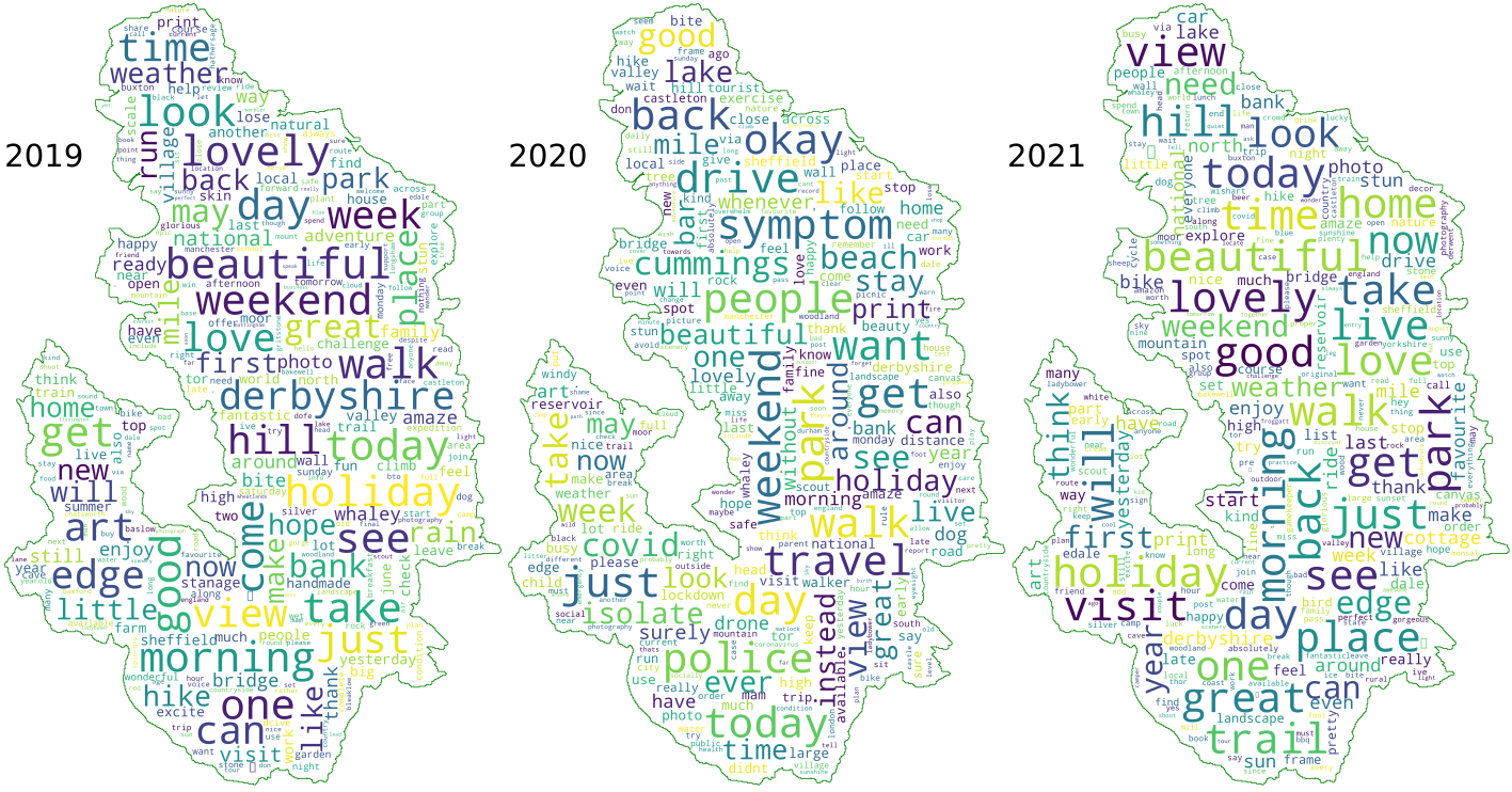
The 30 most frequently used words can be seen in Table 2. Most striking is the use of the word 'walk’ in the year 2020 with 100 mentions, compared to 49 in 2019 and 60 in 2021. Words associated with Covid and restrictions in 2020 included people (89 mentions), symptom (62 mentions), police (48 mentions), Cummings (43 mentions), isolate (36 mentions), drone (25 mentions), lockdown (19 mentions), busy (17 mentions). While positive adjectives rank high in 2019 (good: 5, beautiful: 8, lovely: 13) and 2021 (good: 1, beautiful: 8, lovely: 10), such positive words are not found higher than rank 8 - 'okay’ - and rank 19 - 'good’ - in 2020. A similar sentiment shift, as seen in the hashtag analysis, seems to emerge, which will be explored further in the next section, focusing on sentiment in particular.
| Words 2019 | Count | Words 2020 | Count | Words 2021 | Count |
|---|---|---|---|---|---|
| today | 62 | walk | 100 | good | 73 |
| day | 60 | people | 89 | day | 67 |
| walk | 49 | park | 86 | today | 61 |
| good | 44 | want | 73 | walk | 60 |
| get | 36 | today | 69 | get | 56 |
| see | 35 | day | 69 | just | 56 |
| beautiful | 33 | okay | 68 | beautiful | 55 |
| take | 31 | symptom | 62 | one | 47 |
| one | 31 | just | 60 | lovely | 40 |
| look | 30 | get | 58 | holiday | 37 |
| weekend | 30 | drive | 56 | great | 36 |
| lovely | 29 | travel | 54 | take | 35 |
| holiday | 28 | police | 48 | live | 35 |
| morning | 28 | weekend | 45 | hill | 33 |
| derbyshire | 27 | back | 44 | see | 33 |
| come | 27 | cummings | 43 | morning | 33 |
| edge | 26 | vsee | 41 | home | 31 |
| love | 26 | good | 41 | place | 31 |
| time | 26 | beach | 40 | will | 30 |
| week | 25 | can | 38 | love | 29 |
| hill | 25 | covid | 38 | view | 29 |
| view | 24 | week | 38 | park | 29 |
| can | 23 | view | 37 | time | 28 |
| just | 22 | take | 37 | trail | 28 |
| art | 22 | holiday | 36 | visit | 27 |
| great | 21 | ever | 36 | back | 27 |
| place | 21 | lake | 36 | look | 27 |
| may | 21 | isolate | 36 | now | 27 |
| bank | 20 | like | 34 | edge | 27 |
| weather | 20 | stay | 34 | can | 26 |
Word associations allow an insight into the relationship of nouns (for example, place names and monument types) with other nouns or verbs (for example, activities) or adjectives (for example, sentiment expressions). For this project, frequently used words from the keyword analysis, such as 'walk’, 'see’, 'view’, 'honeypot’, 'landscape’, and 'place’, were analysed. Focusing on place attachment, place qualities and local heritage, to give useful background information for heritage management, additional terms not included in the word frequency list were also provided to the function, such as 'heritage’, 'history’, and 'monument’. The word associations can be visualised as a network graph (Figure 2).
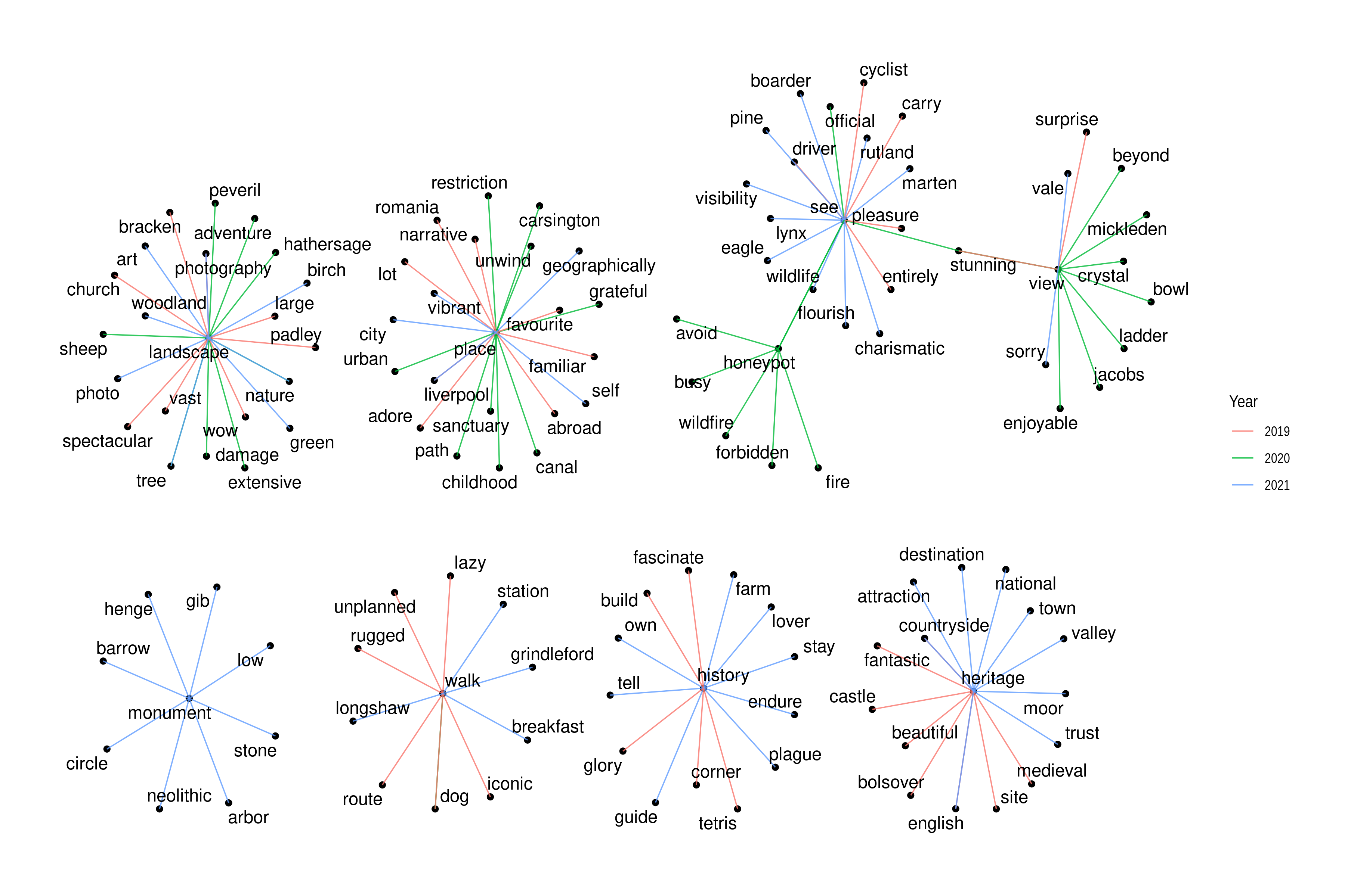
In 2020 the word 'walk' was solely associated with the word 'dog'. The word 'see' was associated with 'official', ’stunning' and 'honeypot'. 'View' found association with 'crystal', 'bowl', 'enjoyable', 'Mickleden', 'stunning', 'Jacobs', 'ladder', 'beyond'. The word 'honeypot' found association with 'wildfire', 'fire', 'avoid' and 'busy', 'see' and 'forbidden'. 'Landscape' was associated with 'damage', 'extensive', 'tree', 'nature', 'sheep', 'adventure', 'Peveril' and 'Hathersage'. The word 'place' found association with 'path', 'canal', 'childhood', 'sanctuary', 'urban', 'restriction', 'Carsington', 'unwind' and 'grateful'. No associations with the word 'history', 'heritage', or 'monument' were found in 2020.
The associations in 2019 were as follows: history: corner, fascinate, Tetris ('Tetris' being the name of one of the bouldering areas at The Roaches), glory, build; heritage: Bolsover, English, medieval, beautiful, site, castle, countryside, fantastic; monument: none; walk: iconic, lazy, rugged, route, unplanned, dog; see: carry, driver, cyclist, entirely, pleasure; view: surprise, stunning; honeypot: none; landscape: photography, large, wow, vast, bracken, spectacular, church, Padley; place: favourite, abroad, adore, Romania, Liverpool, lot, familiar, narrative.
Associations in the year 2021 comprised: history: lover, endure, farm, own, plague, guide, stay, tell; heritage: English, attraction, destination, national, trust, town, countryside, valley, moor; monument: arbor, gib, barrow, henge neolithic, circle, low, stone; walk: Longshaw, Grindleford, station, breakfast; see: boarder, Rutland, visibility, charismatic, eagle, lynx, marten, wildlife, pine, flourish; view: vale, sorry; honeypot: none; landscape: art, nature, tree, photography, birch, woodland, photo, green; place: geographically, Liverpool, vibrant, city, self.
The result of the word association analysis can be understood as a statistical association of the given words and words meeting or exceeding the correlation threshold. This information can be used to identify issues through a follow-up contextual association. A comparison across the word correlation and keywords used in tweets during the study periods shows a notable shift from destinations and travel abroad in 2019 to a focus on local places associated with words of familiarity and safety ('sanctuary’) in 2020. This trend of localism and travel destinations in the vicinity seems to be continued in 2021 with a tendency to explore reopened sites of English Heritage and the National Trust as well as a significant increase of associated monuments, for example, Arbor Low (henge monument) and Gib Hill barrow, stone circles, and Longshaw (National Trust estate). Notable is, however, also the association of 'landscape’ with 'damage’ and 'honeypot’ with 'wildfire’, which could hint at problems with negative landscape impact factors in 2020.
Word clouds were developed first by the American socio-psychologist Stanley Milgram, visualising landmarks in Paris as text on a map (Cao and Cui 2016, 60; Milgram and Jodelet 1992, 96, fig. 8.6), but the popularity of this form of visually conveying textual content only came with Flickr in 2006 and the popular tag visualisation for exploring their website (Temple 2019). Word clouds have disadvantages - for example, they do not show word associations or contexts of single words (Cao and Cui 2016, 19), and apply a filter that is either too restrictive (emphasising long words) or too broad (including short words with irrelevant contribution) (Temple 2019). However, advantages of word clouds are the instant understanding of the visualisation without the need for explanation, legends or descriptions. The visualisations are attractive and colourful and allow the representation of keywords of unstructured texts in a compact form (Temple 2019). The word clouds in Figure 3 present the most frequently used words in tweets across the study periods in a visually appealing format. The words are not spatially located at the corresponding places of tweet locations.
Sentiment and emoji analysis are closely related since much of the sentiment in tweets is carried by the use of emojis rather than text owing to the characteristic shortness of tweets. We should understand emojis as not one but two categories of pictograms (the western association of emojis = emotion is misleading). Category one emojis expressing emotions, which developed from the earlier emoticons, are ideal for conveying sentiment on its own or in conjunction with text, and VADER integrates this aspect for a comprehensive result. We need to distinguish this category of emojis from pictograms used to convey meaning. Emojis, such as a tree, a fruit or boots, replace objects and actions. With regard to sentiment analysis, this categorisation is important, as emotion-emojis are unlikely to change their meaning (a smiling face will unlikely express a negative feeling in future), while object- or action-emojis can change meaning drastically. Within the VADER lexicon both categories are replaced by their respective descriptive text and become part of the text that is then analysed for sentiment. VADER includes the transcription of 3570 different emojis into text at the time of writing and integrates this into the analysis. Based on this descriptive text and the independent score of 10 individuals (Hutto and Gilbert 2014, 220), the valence score was determined, and all emojis with a non-zero mean score were integrated into the lexicon. This section will present the data of the emoji analysis and present the results of the VADER algorithm applied to text and emojis as far as they were known at the time of development in 2017.
The number of emojis used in tweets across the weekends are as follows and shown in detail in Table 3.
2019: 110 different types, 267 in total
2020: 118 different types, 313 in total
2021: 121 different types, 337 in total
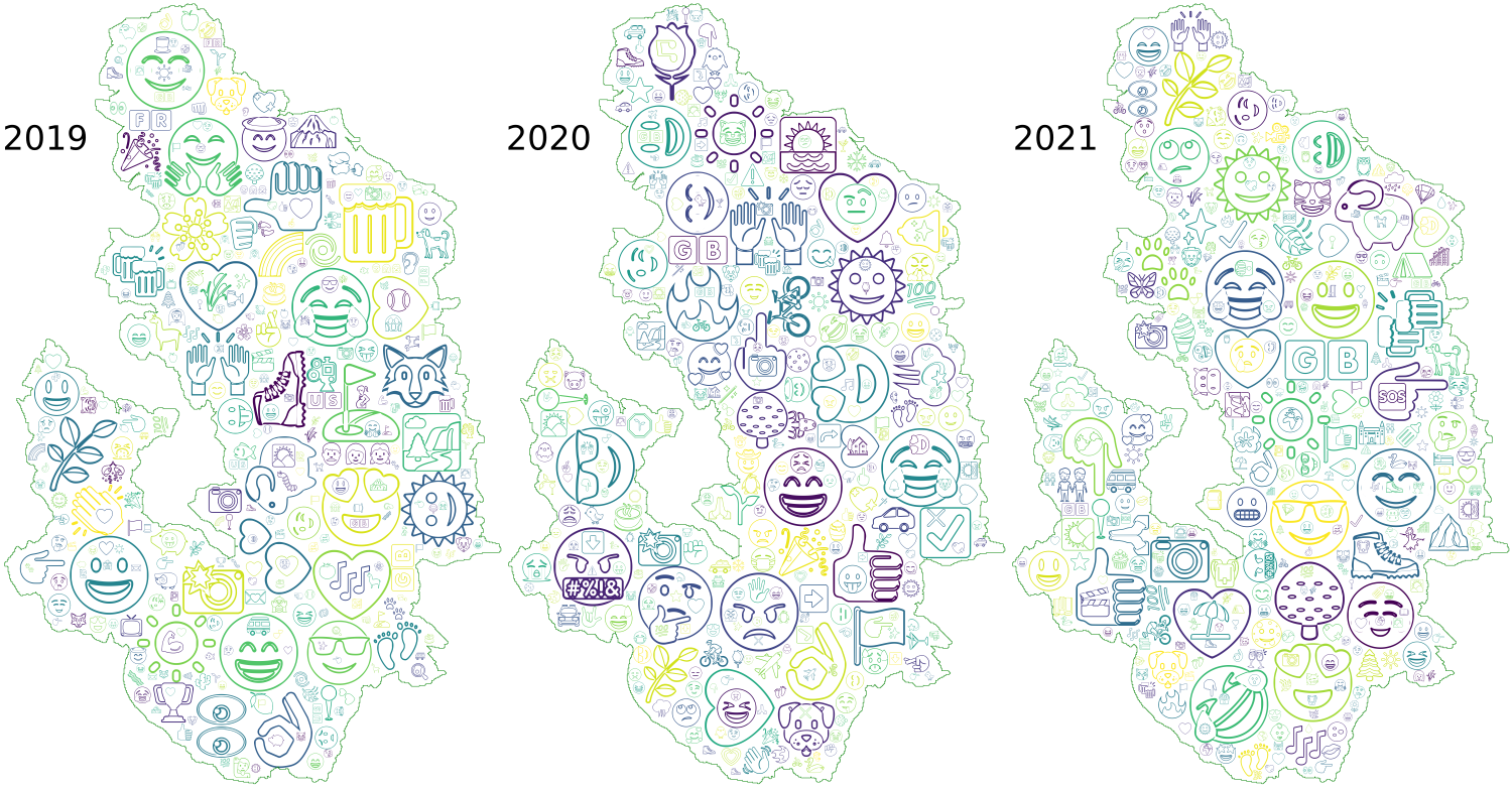
The most commonly used emojis across the years on rank 1 in 2019 and 2020 and rank 3 in 2021 was the smiling face with heart-eyes associated with a positive sentiment. Notable is the increase of negative sentiment expressed through emojis, such as the angry face and 🤬 the angry face with symbols on mouth. The message associated with this category of negative emotions in 2020 and a complete lack of these emojis in 2019, and for 🤬 with only 2 appearances in the dataset and with only one use, can be interpreted as associated with rising tensions in 2020. Users were positioned on both sides of the spectrum: visitors who felt anger towards the excluding attitude of residents, and residents feeling overwhelmed and angry towards visitors, littering, parking in non-designated areas, overcrowding, and increasing wildfire risks from barbecues. Associated with the latter is the increased use of the 🔥 emoji in the same year. This emoji, within a grey zone between emotion and object, plays a specific role in the issues of the year 2020. Fire, as the descriptor of this emoji, scores negatively in the VADER lexicon (-1.4). Negatively labelled emojis (fire, angry face, and face with symbols on mouth) were non-existent in the dataset of 2019, increased to 18 in 2020 and decreased again to 3 in 2021. A new introduction of emojis into tweets is the emoji, referring to safety measures associated with the Covid-19 pandemic. As for emojis of category two, the green-leaved branch 🌿 titled herb is usually used to represent nature in the main context of tweets and is often associated with the #naturelover. Equal emphasis on nature and the rural character of the Peak District National Park are expressed in the use of the 🌲 emoji, 🌳 emoji, 🌱 emoji and 🐑 emoji. Interestingly, no sheep emoji is used in 2020 tweets.
Summarising the results of the emoji analysis, the number of negative emojis varied across the years; however, compared to the number of positively labelled emojis, the number of negative emojis stayed low. While still overwhelmingly positive, the year 2020 saw a notable increase in negative emojis and the introduction of emojis associated with the pandemic. The graph in Figure 4 shows the variation of negative and positive emojis used across the years based on emojis using only the VADER algorithm.
| Emoji 2019 | Count | Emoji 2020 | Count | Emoji 2021 | Count |
|---|---|---|---|---|---|
| 😍 | 29 | 😍 | 22 | ☀️ | 25 |
| 🥾 | 19 | ☀️ | 13 | ❤️ | 18 |
| ❤️ | 11 | 👍 | 11 | 😍 | 17 |
| 👍 | 10 | 🤔 | 9 | 😊 | 13 |
| ☀️ | 9 | 💙 | 9 | 😀 | 11 |
| 😂 | 9 | 🙌 | 8 | 😎 | 10 |
| 💚 | 9 | 🖕 | 8 | 🌞 | 10 |
| ⛳ | 7 | 👌 | 7 | 👍 | 9 |
| 😁 | 7 | 🌞 | 7 | 😂 | 7 |
| 😊 | 6 | 😂 | 7 | 👉 | 7 |
| 🤗 | 5 | 😁 | 7 | 🌿 | 7 |
| 😀 | 5 | 😡 | 6 | 🐑 | 7 |
| 🍺 | 4 | 🤬 | 6 | 🌳 | 6 |
| 🐑 | 4 | ❤️ | 6 | 👇 | 6 |
| 🌿 | 4 | 😎 | 6 | 🤣 | 4 |
| 👌 | 4 | 🌹 | 6 | 🥾 | 4 |
| 💕 | 4 | 🔥 | 6 | ☺️ | 4 |
| 🌞 | 3 | 💨 | 5 | 🐾 | 4 |
| 🐺 | 3 | 😊 | 5 | 🍻 | 4 |
| 🌸 | 3 | 😃 | 5 | 💙 | 4 |

Emojis and cloud visualisations have a great potential to convey complex information directly. The format of emoji-cloud visualisation offers a new way to create an instant understanding of the overall situation, trends, and sentiments of large datasets. The emoji clouds presented in Figure 5 clearly show the emotional shift in 2020 and can be used to inform and engage the public, similar to the word clouds in Section 3.2.2.1, but arguably with a more straightforward and stronger message. The positions of emojis on the map do not correspond with their actual tweet location, and the size of the emojis does not give absolute numerical values. However, this form of visualisation allows instant recognition of the key message and invites engagement with the visualisation beyond passive observation. The key message of a shift towards negative emojis is clearly visible in the year 2020 through the use of distinctly negative icons. Similarly, the smiling face emojis for expressing associations with nature, love and outdoor activities dominate in 2019 and 2021.
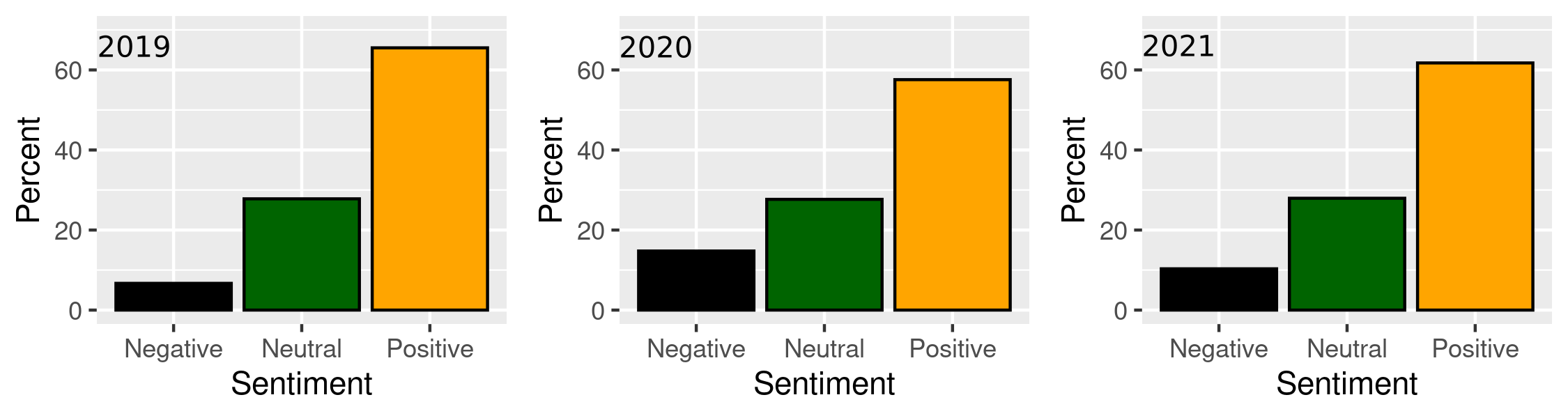
This shift to slightly more negative emotions associated with the Peak District National Park shown in the emoji analysis above is mirrored in the sentiment analysis performed on the datasets of all years using VADER sentiment. The score is normalised for the categories 'Negative’, 'Neutral’, and 'Positive’ tweets of the respective years. The analysis result (Figure 6) shows an increase in identified negative emotions captured in tweets in 2019 from 6.7% to 14.8% in 2020 and a subsequent decrease in 2021 to 10.3%.
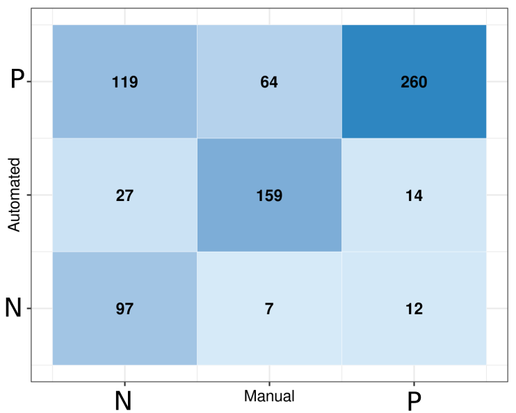
To assess the performance of the VADER algorithm in extraordinary circumstances as was the case in the year 2020, which has shown a doubling of negative sentiments from the year before, a sample including all tweets from that year has been annotated manually by me. The algorithm seemed to struggle, especially with the sarcasm of Twitter users in response to the Dominic-Cummings-situation travelling from London to Durham during a strict stay at home period. Also, sarcasm of visitors, deterred by police action and 'stay away’ messages from residents, and sarcasm referring to the general Covid situation was misinterpreted by the algorithm. Figure 7 shows a confusion matrix for the accuracy as predicted by the VADER algorithm and manually assessed by me. The darker blue fields with higher numbers represent higher counts of tweets representing tweets identified as positive, neutral or negative by the VADER algorithm on the y-axis and by me on the x-axis, respectively. For example, tweet content identified as positive by both the algorithm and the researcher is positioned in the upper right field of the matrix (dark blue, count: 260), representing True-Positive results. In contrast, tweet content identified as positive sentiment by the algorithm and negative by me is represented by the field in the upper left area of the matrix (mid-blue, count 119), which shows the False-Positive result. The matrix shows a high agreement of positive results (260) and True-Neutral results (159). However, discrepancies are apparent in the high mismatch of False-Positives (119). The algorithm was evidently not able to identify negative sentiments accurately, in particular if these were expressed using sarcasm and irony.
The accuracy in the case of tweets of the year 2020 can be calculated as:
\[ Acc = \frac{\sum_{i=1}^3 C_{i,i}}{ \sum_{i,j=1}^3 C_{i,j}}=0.677=67.7\% \]
\(C\) is the count of the respective combination of positive, neutral and negative: \(C_{ii}\) for coincidence between automatic and manual assessment, i.e., \(C_{11}\), \(C_{22}\), \(C_{33}\) for True-Positive, True-Neutral, and True-Negative, respectively, and \(C_{ij}\) with \(i \neq j\) for contradictions, i.e., False-Positive, False-Neutral and False-Negative for \(j = 1, 2, 3\), respectively.The calculation of the proportion of negative tweets based on the results of manual assessment (Figure 7) results, therefore, in 32% tweets with negative sentiment as opposed to the 14.8% identified by the algorithm. In order to assess how this process would adjust the negatively loaded tweets of the years 2019 and 2021, the same process of manual annotation and creation of a confusion matrix was carried out for these years. The result for 2019 showed that the negative sentiment classified by the VADER algorithm with 6.7% was higher than when assessed by the manual process with 3.4%. VADER also tended to classify more positive tweet content compared to a more neutral manual annotation (Figure 8). The manual analysis of the year 2021 data also shows a slightly lower negativity score, with 8.5% compared to the VADER sentiment analysis outcome with 10.3% (Figure 9). This result shows that the sarcasm of the year 2020 was not detectable by the algorithm, and across the three years, neutral tweets were more often interpreted as positive. Given the (slight) under estimation of negativity in 2019 and 2021, and the under representation of negativity in 2020 by the algorithm, the increase of negativity in 2020 is even more striking in the manual assessment.


Location data provided by Twitter and by Twitter users consists of three types: 1. geotagged tweet information in the metadata of individual tweets, 2. free-text entries of user home locations and 3. locations mentioned as places in individual tweet texts. Passive geoinformation (1) stored in metadata of tweets strongly depends on the active use of geotagging services, for example, enabling this service and allowing access to location data on the device used for tweeting. On the other hand, location mentioning (3) and information on user home location (2) are open to the user’s creativity and the willingness to give more or less precise information about themselves, if any at all. To analyse the latter location information, a frequency analysis can be performed to get a rough idea of where Twitter users are located or where they live.
Geotagged information (1) was found to be unreliable, as the location mentioned in texts and the geotagged information in some test cases did not match. Therefore, no further analysis was performed, including this information. Where user home location data (2) was provided, it was assumed that a summary would give an insight into the adherence of Twitter users to restrictions on movement as issued in the 'stay local’ requirement. However, user home location data is imprecise, sparse and inherently unreliable as the input consists of a free text entry. While algorithms determining the home location of Twitter users from the triangulated locations of their geotagged tweets have been developed elsewhere (Mahmud et al. 2014), these are not used in this project since the focus is on place and place attachment rather than on individuals.
Therefore, the main research focus of this project is on the information provided as free text in the tweets (3). This location information was analysed in order to identify places most frequented and talked about during the study periods, which also gave insight into the travel behaviour of visitors to the National Park. Therefore, it is necessary to explore this category further as a component of unstructured text and develop an automated process to overcome the time-consuming manual extraction of geospatial data from qualitative data. This process will be further elaborated on below.
Geospatial expressions in texts are inherently challenging to analyse, and this applies in particular to the recognition of location entities in unstructured texts such as tweets. The main challenge for identifying and extracting location information from tweets proves to be variations in expressing and naming places. Various levels of 'insider terminology’, contractions, and misspelling are a constant issue in the automated recognition of places. However, despite these limitations, an algorithm coded in R and Python allows the extraction of location information from tweets to gain insight into places that matter to people and are trending - for positive or negative reasons - in the wider public.
In order to automatically recognise locations, rivers, points of interest, and historical places, the creation of a gazetteer (a database for geographical information in conjunction with a map in the form of an index or dictionary) was necessary to provide a database for an entity search algorithm. Geospatial information was extracted in QGIS from freely available GIS shapefiles provided by Ordnance Survey (OS) (Ordnance Survey n.d.), the Edinburgh University’s Edina Digimap Service (University of Edinburgh n.d.) (note: Edina maps and data are only freely available for research and education purposes), and Historic England’s (HE) Listing Data from the National Heritage List of England (NHLE) (Historic England 2022). The datasets were merged and clipped to the study area. The resulting attribute table was exported to a spreadsheet and cleaned in a further step to delete duplication and exclude some entries, such as pharmacies or surgeries, to focus on places associated with natural or cultural landscapes. Businesses, such as tea shops, campsites or holiday cottages, were retained as they are part of the tourism industry. The cleaned database was re-imported into GIS to extract the location data of all points (Figure 10). The resulting gazetteer of places tailored to the Peak District National Park can be used as a standalone dictionary for place entity recognition in order to extract locations mentioned in tweets. The created gazetteer includes over 5000 entries of, for example, rivers, bridges, locations of mines, stately homes, bowl barrows, farms, public houses, churches, towns and villages, rock formations and caves, and walking trails. The comprehensive gazetteer of points of interest and named landscapes visualised in GIS shows a continuous and sufficiently fine-grained coverage of locations across the Peak District National Park. An algorithm implemented in Python compares the gazetteer with the unstructured tweet texts and builds a separate dataset of location entities for further analysis and visualisation. The algorithm extracts single word locations as well as compound terms. As identified during the familiarisation process with the data, the challenge of fuzzy and imprecise location-naming in tweets had to be overcome by allowing the detection of, for example, incomplete location descriptions, such as 'Kinder’ for 'Kinder Scout’, but also detect the compound term, for example, 'kinderscout’ without counting the variants independently when mentioned together in one tweet. This method allows the creation of a unique set of distinct features and places in an area similar to Named Entity Recognition (NER) as part of NLP. However, the method detects locations with higher accuracy through the area-specific corpus of distinct locations.
While this research did not go so far as to track down the users’ locations through the algorithm developed by Mahmud and his team (Mahmud et al. 2014), the free text self-identification of the users’ location gave a rough idea of where the tweeters came from during the lockdown phases (home location of users entered by the users). Did the stay at home order work? Did people adhere to the restrictions? Some entries of user location consisted of incomplete, fancy and funny entries and very general spatial information, for example, 'United Kingdom’ or 'No boundaries’. Nevertheless, the user location information was analysed on the frequency of occurrence and provides insight into the home location of tweeters (Table 4). The analysis shows that across all years, the majority of tweets associated with the Peak District National Park originated from users based in the National Park itself or the surrounding areas of larger cities within reach, for example, Sheffield, Chesterfield and Manchester. During the years 2019 and 2021, user locations further away appear as well, for example, Nottingham, Derby, Wales, Hampshire and Rochester. In 2020, the stay local orders appear to have been followed by the majority of visitors to the National Park, evidenced by the user locations mostly located in or surrounding the park, with some exceptions such as tweets from London and the East Midlands. It is, however, important to note that a tweet from one of these more distant locations does not necessarily mean that the person was actually in the park; tweeters could have just mentioned the park in the text. This was the case for tweets where the tweeter was, for example, longing to come back or missing the visits to the National Park.
| Users 2019 | Count | Users 2020 | Count | Users 2021 | Count |
|---|---|---|---|---|---|
| Sheffield, England | 39 | Sheffield, England | 46 | Sheffield, England | 34 |
| United Kingdom | 17 | United Kingdom | 45 | United Kingdom | 26 |
| Whaley Bridge, Peak District | 12 | Derbyshire | 25 | UK | 16 |
| UK | 11 | UK | 15 | East Midlands, England | 15 |
| England, United Kingdom | 9 | Sheffield | 13 | England, United Kingdom | 13 |
| Manchester, England | 9 | England, United Kingdom | 12 | Manchester, England | 12 |
| Peak District | 9 | Whaley Bridge, Peak District | 12 | Sheffield | 12 |
| Redcar, North East England | 9 | Peak District, Derbyshire, UK | 11 | Buxton, England | 10 |
| Derbyshire | 8 | Peak District, UK | 9 | Derby, England | 10 |
| Nottingham | 7 | Manchester | 8 | High Peak, Derbyshire | 10 |
| Rochester, South East | 7 | Nottingham, England | 8 | Sheffield, UK | 9 |
| Sheffield | 7 | Derby, England | 7 | Chesterfield, England | 7 |
| London | 6 | Peak District | 7 | Derbyshire/Lothian | 7 |
| London, England | 6 | Holmfirth | 6 | London | 7 |
| Peak District, UK | 6 | London, England | 6 | London, England | 7 |
| Manchester, UK | 5 | Manchester, England | 6 | Derbyshire | 6 |
| Matlock, England | 5 | The heart of Yorkshire | 6 | Derbyshire - Peak District | 6 |
| Bakewell, England | 4 | England | 5 | Whaley Bridge, Peak District | 6 |
| Hampshire | 4 | London, UK | 5 | Peak District | 5 |
| Hayfield, England | 4 | 🌎 No boundaries 🏳️🌈 | 4 | Bakewell, England | 4 |
| Northwich, England | 4 | Buxton & Sheffield | 4 | Chesterfield ,Derbyshire | 4 |
| Nottingham, England | 4 | East Midlands, England | 4 | Matlock, England | 4 |
| Peak District and north London | 4 | England, UK | 4 | Nottingham | 4 |
| Ashbourne, Derbyshire, UK | 3 | High Peak | 4 | Wales | 4 |
| Bakewell | 3 | Lincolnshire | 4 | Yorkshire | 4 |
In summary, it can be noted that the analysis of user home location is not reliable. Location information from tweet text metadata does not necessarily match the location mentioned in the tweet. In contrast, extracting and geospatially locating places mentioned in tweet texts can offer more reliable data on locations visited by Twitter users, highlighting trends as well as residents’ and visitors’ behaviour and sentiment associated with specific places in the national park. The automated recognition and analysis of locations in tweet texts was further developed as part of the unstructured text analysis and will be elaborated on in the next section.
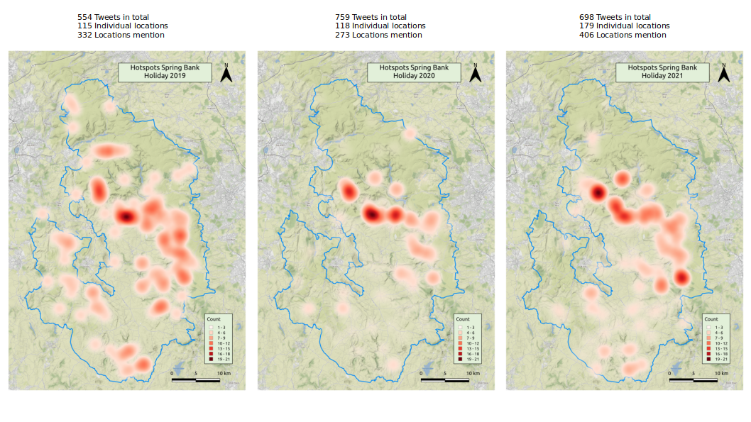
The automated process using the gazetteer developed in Section 4.1.3 recognised 115 individual places mentioned 332 times in 2019. The weekend in 2020 identified 118 different locations with 237 mentions. This 2020 result was also manually evaluated, the dataset annotated by me, and tested against the automated process described in Section 4.1.3. The weekend in 2021 yielded 179 unique places with 406 mentions in individual tweets.
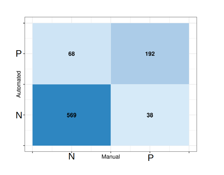
A subset of data was analysed manually to assess the reliability of the location entity recognition process. The 759 tweets of the bank holiday weekend 2020 were used to compare the performance of the code and the completeness of the location database created in the first step of the process. The manually evaluated list of locations provided the gold standard for the comparison. Results from the manual and automated processes were subsequently evaluated, giving the True-Positive and True-Negative results with corresponding outcomes and False-Positive and False-Negative results where the automated process produced an error. In total, 569 True-Negative (no location mentioned in the tweet) and 192 True-Positive results (location in both processes identical) were recorded. The weakness of the algorithm is shown by the 68 False-Positives (location wrongly identified by the algorithm) and 38 False-Negatives (location not identified by the algorithm). Figure 11 shows a confusion matrix visualising the comparison of the algorithm.
The accuracy of the automation algorithm can be calculated using the equation:
\[
Acc = \frac{TP + TN}{TP + TN + FP + FN} = 0.876 = 87.6\%
\]
With nearly 88% accuracy, the algorithm using the area-specific location data proves efficient in recognising places mentioned in tweets. Extracting this information from qualitative, unstructured text is necessary to map the locations as hot spots for activity, which can subsequently be visualised in GIS.
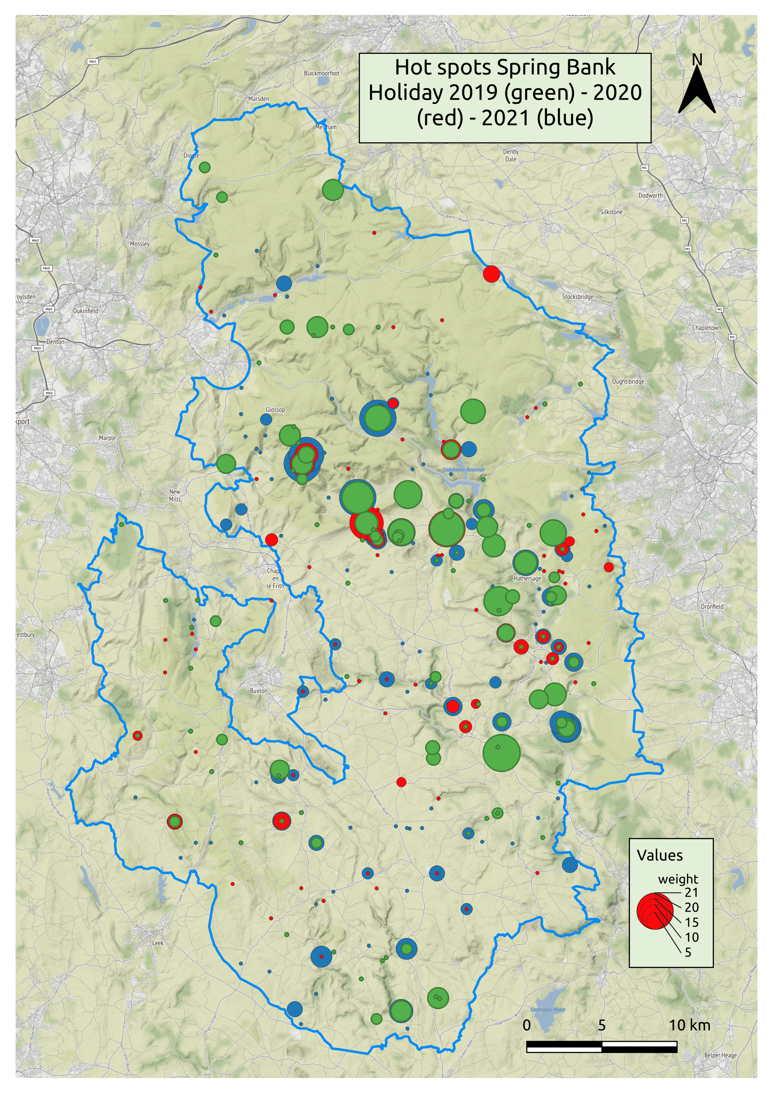
GIS maps offer increased opportunities for interrogation and engagement with the data. The great advantage of GIS maps is their flexibility, dynamic quality, and ability to connect databases of varying complexity to spatial expressions. Visualising the content of unstructured text, such as tweets, allows insights on various levels and topics, for instance the most frequently mentioned places or activities or problems associated with visitors and tourism. The geospatial data extracted from the tweets are visualised in GIS in the interactive web map shown in Figure 12 as point features and hotspots. The web map was created using QGIS v.3.16 and exported to OpenLayers using QGIS2Web plugin. Point data shows the location name and counts of mentions in tweets as numbers in a pop-up field. To visually present the variation across the locations based on the weight (numbers of mentions), heatmap layers were created, showing the intensity of frequency. The years 2019 (green point data, green heatmaps), 2020 (red point data, red heatmap), and 2021 (blue point data, blue heatmap) can be used individually and independently as overlay maps to allow interrogation of the various factors. Zooming in on specific locations allows an intensive exploration of the study area, highlighting areas of high impact on landscapes but also access roads, parking issues, and locations requiring individual and specific support on different levels. Owing to the nature of these maps, they can be used intuitively, not just by practitioners and researchers but also by the wider public, to interrogate the landscapes and places of interest in detail.
The interpretation of the maps will be discussed further in Section 6. However, the following will detail some of the hotspots featuring prominently on the map. The characteristics and qualities of the locations highlighted on the map vary, including areas of natural, historical and communal features. Bakewell in the White Peak, a historic market town on the River Wye, represents a typical 'chocolate box village’ character with 17th-century architecture, country fairs and markets, shopping opportunities, as well as the famous Bakewell tart, traditional well-dressing and a carnival. Various features in the town are scheduled monuments or listed buildings, such as the Bakewell Bridge, Lumford Mill, the motte and bailey castle and All Saints Church with Anglo-Saxon crosses. Similar but smaller places appear in tweets located in the Dark Peak, for example, Edale, Hope and Castleton. These small villages and towns are situated among rolling hills, offering shopping opportunities for the famous Blue John stone found in the caves around Castleton. Edale marks the start of the Pennine way, a long-distance National Trail. Castleton is situated at Winnats Pass and the 'Broken Road’, the A625, a torn and twisted road built on a moving geology typical for the surrounding mountains. Historically, Castleton lies in the shadow of Peveril Castle, the 11th-14th century tower keep castle. Mam Tor, a Bronze Age hillfort of national importance lies just beyond Winnats Pass and offers wide views across the valleys and along the ridgeway, its other end connected to Lose Hill - another favourite viewpoint across the valleys. Hope lies close to the Roman fort 'Navio’, one of the few traces of Roman life in the Peak District. These areas are favoured by visitors and residents for the natural beauty, stunning views, and opportunities for various outdoor activities, such as cycling, walking and paragliding. The High Peak comprises Buxton (which is not part of the Peak District National Park) and part of the Dark Peak in the north of the Peak District National Park. Included in this administrative area of the Peak District is the Kinder Plateau, with Kinder Scout being the highest peak in the park, a National Nature Reserve and a Site of Special Scientific Interest (SSSI) formed of 'blanket bog and sub-alpine shrub heath’, an ideal location for bird watching and walking (see also Section 6). Historically, the area is associated with the famous Kinder Mass Trespass in 1932 - a protest for the right to roam the countryside freely. Jacob’s Ladder leads up to Kinder Scout and is part of the Pennine Way and connected to the scheduled packhorse bridge and packhorse route across the Pennines. North of Kinder Scout lies Bleaklow Hill and Bleaklow Stones, known as the site of a plane crash in 1948, complete with the wreckage of a US Air Force bomber. Also favoured for its views by walkers and the rough gritstone formations by climbers, Stanage Edge features prominently in tweet texts. Relics of the former millstone and grindstone production still dominate this area and features as the logo of the park. Last but not least in importance for the Peak District are the great country houses of the park, of which Chatsworth House is one of the most prominent. The Grade I listed house with its history starting in the 16th century is home of the Duke of Devonshire 'passed through 16 generations of the Cavendish family’. With regular events in the spacious surrounding park, Chatsworth attracts visitors and residents for a day out. Together with Stanage Edge, Chatsworth featured in film productions, such as 'Pride and Prejudice’ and there is a strong connection to Jane Austen and the Brontës in the Peak District National Park. The variety of natural, historical and recreational qualities of the Peak District is reflected by the various locations mentioned in tweets and visualised in the hotspot map.S
Various factors limit the generalisation of the results. The data source was limited to a dataset of tweets by Twitter users. Further analysis of other social media platforms was not possible owing to time constraints, limiting investigation of aspects of the structure of other platforms, and ethical approval considerations. A more extensive dataset would have provided more scope to test the application. Because of this limitation, the sample was not representative in a broader sense. However, as surveys associated with heritage are usually limited to visitors to historic sites (English Heritage 2000, 2) or people interested in the subject (National Trust 2017), an advantage of Twitter data is that the dataset reaches beyond the 'usual suspects’. In this respect, the data provided insight into a more variable and diverse group of people.
Limitations of the method are constrained through the accessibility and availability of datasets provided by services such as Ordnance Survey (OS), with finer-grained geo-information only available to commercial or governmental organisations, for example, the '1:50 000 Scale Raster map with Gazetteer’. For educational purposes, these datasets can be acquired through Edina. OS maps provide databases with a searchable data structure allowing data integration. Other datasets, for example, Historic Environment Records (HER) and HE datasets, are difficult to integrate without time-consuming curation of the data owing to inconsistencies in, for example, data entries and unsuitable data structure, which makes querying the data extremely challenging if not impossible. To overcome this problem, datasets were manually adjusted during the compilation of the database for this project. The human component in this research, introduced through manual cleaning of the location database and manual annotation of the test dataset, cannot be neglected. For instance, decisions were made whether to include or exclude locations in the corpus, such as disregarding points that were considered irrelevant to the research aim, for example, pharmacies or surgeries. However, the results were assessed and reviewed several times to improve the algorithm and the database, creating a comprehensive compendium of locations in the study area. In a similar way, the sentiment analysis was assessed by me, introducing a certain level of subjectivity. However, I was fully aware of bias and subjectivity during the analysis phase, and this kind of limitation is part of all research projects that involve a human component. This testing and evaluation process, once finalised, can save time in the subsequent processing of qualitative data in the specific area and, therefore, justifies the effort and introduction of researcher bias/subjectivity.
The visualisation created for this project comprises a map showing point data and heatmap areas, which currently provide limited additional information. However, more details included in the database and additional aspects, for example, sentiment information connected to locations, would provide a broader picture of various aspects of landscape impact and use. Equally, there was no distinction between natural and cultural heritage aspects of the diverse locations. On the one hand, I do not find this a valuable distinction regarding using these maps as a management tool for cultural landscapes in the broader context. On the other hand, this approach aligns with the notion of managing landscapes as a continuous, value-free and complex ecosystem comprising the natural and cultural components. This approach connects natural and cultural features that form cultural landscapes and addresses the various requirements and challenges of mixed landscape form, such as human perception and demands as well as nature and wildlife protection.
The accuracy of the method to automatically identify and extract location data was limited by the ambiguity of location names. For example, 'Hope’ as a place name in the Peak District was several times confused with the verb 'hope’ that was used regularly in conjunction with Covid-19 and the behaviour of visitors. Another area of improvement of the method lies in the regular use of abbreviated place names in the colloquial speech common in tweets. For example, for 'Kinder’, short for 'Kinder Scout’, the algorithm recognised both terms as separate entities but counted these as a single entity, but less common abbreviations cannot be identified by the algorithm. Furthermore, misspelt place names contributed to skewed frequency tables and incomplete map overviews. The method of geospatial entity recognition is accurate to almost 88%. Therefore, 12% of the identified locations are wrongly classified - either as 'False Positive’ or 'False Negative’. The visual representation of locations mentioned in tweets is, subsequently, only reliable to a certain degree. However, as the main aim of the method is to recognise broader trends and sentiments of groups and not to map individual behaviour and movement precisely, the algorithm proves to be sufficiently accurate.
As noted in Section 3.1.3 the results of algorithms applied within the field of rule-based text analysis heavily depends on the underlying database. In the case of VADER sentiment this lexicon was developed in the US, which leads to issues of word sentiment scores based on word meaning. Variation of word meanings between American English (AE) and British English (BE) can lead to ambiguities that should be acknowledged. The word 'quite’ was tested as an example of how severe the difference is overall when used as a modifier, as in, for example, 'quite good’. While numerous meanings in common use are listed in the Oxford Dictionary, the meaning in this case can tend towards 'very good’ (AE) or 'somewhat good’ (BE). The test of the algorithm showed a variance of: 'quite good’ and 'very good’: 0.4927, 'somewhat good’: 0.3832, 'good’: 0.4404. This represents a slight variance in the compound result; however, this would not notably change the overall result of the analysis and can, therefore, be discounted.
Furthermore, the text analysis focused on keywords, their frequency and correlation. While it is possible that the meaning of words can change when viewed as bi-grams (two-word term) or tri-grams (three-word terms), this research did not use this method as the focus. This research aimed to provide methods for a practical and easy approach to visualising textual information, and for this purpose the analysis only considered uni-grams.
The standard social media analysis processes in R and Python enable a thorough interrogation of Twitter data collected from three Spring bank holiday weekends in 2019, 2020 (with Covid restrictions in place), and 2021. Steps in the analysis process include keyword and hashtag analysis, which provide the most frequently used terms for a comparison across the study periods. The results have shown the introduction of new words and hashtags associated with the pandemic. A shift in behaviour and activities and variations in locations mentioned frequently across the study periods has also been noted. Overall, the analysis gave insight into trending topics and issues at respective times. Working with the tweet texts allowed the identification of the most frequent words and word associations with these, as well as with heritage-related terms, such as 'history’, 'heritage’ or 'monument’, providing valuable background information for heritage and resource management of the national park. The study has shown a trend towards local heritage sites following on from 2020, which was dominated by Covid restrictions to movement and socialising. However, the results have also shown that the statistical word association can highlight potential issues and tensions that can be further analysed contextually for planning and action in landscape and heritage management.
One of the two main aims of this study was to assess and present a methodology for sentiment analysis with a focus on visually informative and appealing outputs that engage the public as well as provide background for local authorities. Sentiment analysis, as an automated process, continuously struggles with the nature of unstructured text, as presented in the form of Twitter tweets in this research. Human sarcasm, double meanings, and irony are not sufficiently identified by automated processes yet. Additionally, automated processes and machine learning introduce human subjectivity when preparing training datasets and corpora. The manual analysis of the dataset for 2020 made it obvious how subtle and variable meanings are expressed. The sentiment analysis and emoji visualisations highlighted a notable increase of negative sentiment during the pandemic and its relaxation in the following year. Overall, however, the positive aspects and attitudes towards the National Park were dominant in all three study periods. Emojis proved to be well suited for conveying sentiment, as shown by the emoji cloud visualisations. A separate test of emoji-only sentiment showed that this part of unstructured text can influence the overall sentiment score of a tweet. The integration of emojis in the sentiment analysis was crucial owing to the frequent and increasing use of the symbols in social media and the advantage of the instant understanding of meanings through emojis.
The second main aim of this article was to present a new method of location data extraction from unstructured text. The geo-tagged tweet location and the free-entry user location in Twitter metadata have proved to be less useful for an analysis focusing on place attachment. In contrast, the method for automated recognition of locations mentioned in the tweet texts, developed for this research, proved to be efficient, highly accurate, and effective. The automated recognition of locations was achieved by creating a gazetteer of locations provided and an algorithm that is able to extract the places, landmarks, buildings and natural features by comparison with a dictionary from tweet texts. While comparable algorithms in text mining software already use a similar process (Named Entity Recognition), the innovative aspect of this research lies in the method of compiling a gazetteer from existing databases providing a framework for fine-grained entity recognition in specific areas. The accuracy of corpus and algorithm of almost 88% provides a sound basis for a sufficiently detailed visualisation in GIS. The visualisation shows a notable shift from favoured locations before the pandemic, mostly focused on 'honeypots’ and 'chocolate box villages’, such as Bakewell and Castleton in a wider distribution across the study area, to natural beauty spots, such as Mam Tor and Kinder Scout during the pandemic restrictions (Figures 13-14). The reasons are most likely the ability to socially distance in these areas and a welcome change of scenery for city dwellers. The temporary closure of businesses in villages and towns across the Peak District during lockdown shifted the most frequented visitor locations from villages and historic buildings towards the open countryside. Being confined to local areas or even the home over a period of weeks raised the awareness of the qualities of places in the vicinity that offered a change of scenery, an opportunity to breathe, increasing the feeling of escaping to the countryside. These conditions led to a high influx of visitors, with no economic advantage for the region. Associated disadvantages, such as overcrowding, damage to moors from barbecue fires and parked cars in undesignated areas, blocking local work traffic, also contributed to the increase of negativity during the pandemic (Jones and McGinlay 2020, 20). The most frequented places across the years can be found in the landscape around Edale and Kinder Scout, which are part of the 'Moors for the Future’ initiative. The interactive webmap that project provides on its website shows areas included in the peat restoration programme and areas heavily impacted by the moor fires. That project also collected and archived the local history and stories from farmers, residents and ramblers between 2010 and 2012; these stories are a snapshot in time documenting important insider knowledge. That project provides a method for a rolling social media observation of trends and insights, which would allow reacting in real-time to the challenges. The hotspot areas of increased visitor influx match areas of peatbog restoration of the 'most degraded landscape in Europe’.
As shown, Twitter data can be used to gain insight into trends and sentiments of the public based on specific key search terms. The interactive map of the most frequently mentioned locations in tweets follows the tradition of Stanley Milgram’s mental map of Paris (Milgram and Jodelet 1992, 96, fig.8.6) and Kevin Lynch’s sketches of social urban landscapes (Lynch 1960). While these projects mapped social behaviour in urban landscapes, the same principle can be applied in rural landscapes such as the Peak District National Park, as shown in this study. The innovative method presented here offers an efficient and effective tool for location-specific entity recognition with an accuracy of almost 88%. This process can be repeated, scaled, and applied to other areas and landscapes. During the validation process, some issues of the automated process were identified by direct manual referencing of a sample dataset. Such challenges are inherent in automated analysis of natural language and the subject of the field of Natural Language Processing (NLP) and Named Entity Recognition (NER) (Ritter and Clark 2011). Further developments in this area, including advanced machine learning, could improve the process. Potential development of the method could lie in training a model that addresses the shortcomings of this algorithm and further development of the compilation of area-specific, sufficiently fine-grained location gazetteers.
Extracting and visualising geospatial data from unstructured texts will generate data to benefit the public in three ways:
Cultural landscapes, such as the Peak District National Park, bridge the divide between natural and cultural resources. However, this rich and diverse environment also comes with challenges. To be better equipped to react to these challenges, this methodology and the results will be provided to the PDNPA to explore its application and utility in practice. The data will also be provided to the 'Moors for the Future’ initiative and the National Trust. The results of this project may provide background information for the management and protection of these precious resources while at the same time allowing people to enjoy the beautiful and rich landscape of the national park.
Coding support was provided by Dr Torsten Schenkel, Associate Professor at Sheffield Hallam University, Department of Engineering and Mathematics. I am also grateful for valuable discussions on analysis strategies and initial reviews of the draft versions of this article.
I would also like to thank my academic supervisors, Prof. John Schofield for initiating the idea of working with social media data and Prof. Julian D. Richards for his advice on best publishing and archiving strategies.
This project was carried out as a part of a AHRC/UKRI WRoCAH-funded PhD project at the University of York. Grant reference number: AH/R012733/1
The following code block shows one search query parameter set for the second study period.
query1 <- build_query(
  query = c('#peakdistrict', '#PeakDistrictNationalPark',
            '#peakdistrictwalks', 'Peak District',
            'Peak District National Park'),
  is_retweet = FALSE,
  remove_promoted = TRUE,
  lang = 'en',
  exclude = c('recruitment', 'recruiting', '@WhaleyChronicle',
  '@weatherwhaley', '#WeAreWorkingForYou', '@etsyUK', '@etsy',
  'price', '#ukgetaway', '@etsy')
)

get_all_tweets(
    query1,
    start_tweets = '2020-05-23T00:00:59Z',
    end_tweets = '2020-05-25T23:59:59Z',
    data_path = 'tweetdata-20200525',
    bind_tweets = FALSE,
    n = 2000
  )
Full query code and renv dependency file are also available.
Internet Archaeology is an open access journal based in the Department of Archaeology, University of York. Except where otherwise noted, content from this work may be used under the terms of the Creative Commons Attribution 3.0 (CC BY) Unported licence, which permits unrestricted use, distribution, and reproduction in any medium, provided that attribution to the author(s), the title of the work, the Internet Archaeology journal and the relevant URL/DOI are given.
Terms and Conditions | Legal Statements | Privacy Policy | Cookies Policy | Citing Internet Archaeology
Internet Archaeology content is preserved for the long term with the Archaeology Data Service (ROR). Help sustain and support open access publication by donating to our Open Access Archaeology Fund.
 Home
Home