Cite this as: Sterry, M. 2018 Multivariate and Spatial Visualisation of Archaeological Assemblages, Internet Archaeology 50. https://doi.org/10.11141/ia.50.15
The purpose of this article is to demonstrate a method for incorporating, interpreting and visualising the results of multivariate analyses, namely correspondence analysis, in a spatial environment. Visualisation is of crucial importance to the themes of this volume and to archaeology as a discipline in terms of communicating large and complex datasets in a manner that is legible and insightful (Llobera 2011). Two case studies are used to highlight different aspects of this approach. The first case study, of ceramic wares from Vetera I, examines different ways to visualise spatial structure and zonation between assemblage groups using point distributions and interpolated rasters. The second case study, of Samian assemblages from Roman Britain, uses the same method to explore ways of visualising spatio-temporal changes.
Correspondence analysis (CA) is a reductive multivariate technique for analysing associations between different variables and samples and is well suited to exploring archaeological assemblages that can be divided into a multitude of typologies (Baxter 1994; 2003). In the last decades, CA has become increasingly popular. The technique has been used for interpreting archaeological assemblages, including artefacts (e.g. Cool and Baxter 1999), archaeobotanical remains (e.g. Van der Veen 2007; Livarda and Van der Veen 2008) and faunal remains (e.g. Manning et al. 2013a; 2013b). It has been applied more widely to the analysis of ceramic assemblages from a range of contexts, particularly for its utility in seriation (Van de Velden et al. 2009; Peeples and Schachner 2012), and for distinguishing between different cultural groups (Pitts 2007; 2008), and is also widely used within the articles in this volume.
Correspondence analysis maximises the representation of correspondence between rows and columns. CA is typically used to create bi-plots of rows (samples, or in all the examples in this article, archaeological assemblages) and columns (species, types, etc.). In interpreting the results, samples that plot in close proximity to each other on one axis or more should have similar features and correspond with species found that also plot in the same area (the inverse is also true). Thus, this has allowed the observation of archaeological groupings of site types, periods and broad regions. In the case of this article, the technique is used to ask explicit questions of a spatial nature in relation to different ceramic types.
One weakness of correspondence analysis for archaeological analysis is that it makes no reference to the similarity and difference of spatial neighbours, and has only very limited application in defining past regions from archaeological data. Instead, it requires the a priori imposition of regions or fixed geographies. For example, Manning et al. (2013a; 2013b) collected data on animal bone NISP (number of identifiable specimens) from early Neolithic sites in Europe. In their correspondence analysis bi-plot of the data, they were able to identify clear regional differences, with a tendency for cattle and pig in northern and central Europe and wild species and sheep/goat in the Mediterranean (Manning et al. 2013a, fig. 2). However, when it came to creating a visualisation of the data, they instead used distributions of pie charts (Manning et al. 2013b, figs 12.1, 12.6). These charts were then dislocated from the geography of the sites to which they corresponded so that they could be legible and did not overlap with one another. Through this method, one of the key advantages of the correspondence analysis – a means of data exploration – is lost in consequence of the spatial visualisation method used.
Although making use of different data types (i.e. soil chemistry), the method proposed by Dore and López Varela (2010) is of relevance. They used trend-surface analysis to convert their samples into five raster layers representing different chemical residues. Then, drawing on remote sensing techniques, these rasters were used as a basis for a principal components analysis and rescaled to 0-255. The resulting raster dataset was then visualised by assigning the first eigenvector to red, the second to blue and the third to green, with the final visualisation image accounting for 84.48 per cent of variation of the original five raster datasets. This approach has potential strengths and communicates the underlying spatial structure clearly, but the results do not address one of the key weaknesses of reductive techniques: they do not create visualisations that are easily comprehensible without the aid of substantial explanatory text.
Visualisation is not straightforward, and ranges from statistical graphics to data art and illustration. It can be used to demonstrate a particular point, or to allow the viewer to explore the data and data analysis themselves. Reductive techniques are often highly meaningful to the analyst with absolute familiarity with their data, but highly abstract to outsiders. This is particularly the case if the viewer has little or no experience with multivariate statistics and reading scatter graphs, given the lack of a clear relationship between the original dataset and the output of bi-plots. By any measure, this is not ideal for a visualisation.
As a reductionist technique, CA is commonly interpreted through the use of one, two or three axes. The challenge for visualising and interpreting a multivariate analysis in a spatial environment lies in how to convert multiple variables into a comprehensive, intelligible and representative visualisation. Interpretation of archaeological examples has tended toward the interpretation of the relative position of samples to one another on the bi-plots (i.e. two axes). I therefore suggest that colour provides a powerful and intuitive (if imperfect) way of conveying the positions of the data. Put simply, if we are most interested in the similarities and differences between the samples, a spread of colours will show which are more or less similar.
The visualisation of a one-dimensional data-plot can and has been achieved with contrasting colours (e.g. black and white) and varying symbol size so that data points that are at one end of an axis are larger than those in the centre. A divergent colour scheme can also be used so that colours blend from one to another with a neutral colour in the centre (e.g. red to white to blue, see Colorbrewer2.org and Harrower and Brewer 2003).
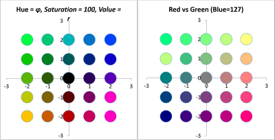
With two-dimensional plots (the bi-plot), we can achieve a similar effect through the use of a colour wheel with colours radiating out from the origin of the bi-plot. Two methods can be used, and in both cases the axis values should be converted from Cartesian to Polar coordinates (Figure 1). In the first method, Φ corresponds to the hue of the symbol (for this article I have chosen the Hue-Saturation-Value (HSV) colour wheel for its ease of use, but this is not the only possible option, see below) and r corresponds to the size of the symbol. This gives a similar effect to the method for one-dimensional data, in that points that are further away from the origin are more distinctive (larger) than points that are closer. The second method is to colour the symbols further by equating r with a value (i.e. brightness) so that points that are closer to the centre are less intense (i.e. darker) and therefore difficult to distinguish from one another.

An alternative approach is to use the Red-Green-Blue (RGB) colour model with a colour assigned to each axis related to red, green or blue (e.g. Red=Axis 1, Green=Axis 2). While this can create visually striking outputs, the results are not easily interpreted. Different combinations of RGB values can create colours that appear similar to one another (i.e. colour similarity no longer relates directly to the closeness of data-points) and there is no straightforward way to link a colour back to a space or direction on the data-plot with the origin coloured. This can potentially obscure meaningful patterning in the data.
The visual interpretation of three-dimensional plots is challenging, and is perhaps most commonly used when the data can be seen to form distinctive and spatially separated groups (such as familial groups). The RGB colour model can readily be adapted to three dimensions (with the same caveats as described above), but the conical HSV model is not suitable. The CIELAB colour space (defined by the Commission Internationale de l'Eclairage), designed to represent all possible colours perceived by humans, is spherical and presents another possible alternative with L (0=black, 100=white), a (-a=green, +a=red) and b (-b=blue, +b=yellow), although a large proportion of the coordinate space either cannot be seen by human vision or cannot be displayed on a standard computer screen, which creates other problems.
In the remainder of this article, I demonstrate two different applications of the methods described here to case studies with varying forms of data, scale and temporal depth. In both, I strive to communicate the trends that I have observed in the data as clearly and simply to the viewer as possible.
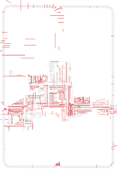
The first case study is the ceramic assemblage from the site of Vetera I, a late first century BCE to early first century CE Roman fortress at Xanten, Germany (Hanel 1995; Allison 2008; 2013). Excavations produced a vessel assemblage of c. 9000 diagnostic sherds from 520 trenches (Figure 2). The data are particularly suited for querying whether different groups within the fortress (e.g. officers, soldiers, etc.) had different, and perhaps spatially segregated, dining practices that are identifiable in their discarded ceramics (cf. Allison this volume, 3.2), where Figure 2 presents percentages of Vetera I tablewares and their form types). The ceramics can be divided by fabric or form to create tables suitable for correspondence analysis, with the trenches treated as discrete samples. A version of this analysis is presented in Allison and Sterry 2015; this article updates and builds upon the initial analysis with greater emphasis on method and visualisation. There are constraints to this analysis; the ceramics themselves were not available for analysis and so it was not possible to modify the categorisation of Hanel (1995) into something that was better suited to identifying distinct dining practices. A new categorisation from the dataset using a combination of fabric and form (i.e. South-Gaulish bowl, Belgic platter, etc.) may be more effective, but equally we might consider the vessel diameter or height to be pertinent (variables not consistently available from the dataset). In this article, only fabric is used (Table 1) to allow for a more straightforward focus on the method of analysis. A correspondence analysis of the data table creates a bi-plot with a good distribution of the different fabric types and trenches (Figure 3 [SVG]). Ceramics of similar origin and type cluster with each other; hence we can distinguish wares of Italian origin (thin-walled wares and possibly so-called Pompeian Red Ware, see Hanel 1995, 257-59), wares more closely related to food preparation and storage (mortaria, amphorae, and various other coarse or 'utilitarian' wares) and non-ceramic vessels of bronze and glass. The different terra sigillata types, Arretine and South Gaulish, are also well defined and opposed to each other.
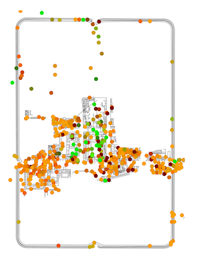
Using these axis values, RGB and HSV colour models (as described above) were generated. For the RGB colour models, the first and second axes were independently scaled to run from 0 to 255. These revised scores were then added as an attribute to a point-distribution of trench centroids and used to create thematic point distribution (Figure 4; this can be done in QGIS using the definition color_rgb([axis-1],[axis-2],0); note that blue is set to 0). For the HSV colour model, the first and second axis scores were first converted to Polar coordinates and then scaled so that Φ runs from 0-360 and r from 0-100 (Figure 5). Again, in QGIS, the definition is color_hsv([Φ],100,[r]) (note that saturation is set to 100). The same approach could also be used with the polygon layer of the trenches themselves, but centroids are preferred for their clarity.
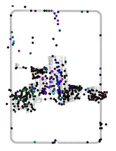
In the RGB colour model (Figure 4), the dominant colour is orange with a strong cluster of greens in the centre and dark reds and browns scattered around. This highlights that the trenches across the central buildings had different assemblages to other parts of the fort (with the northern trenches registering as in between) and that there is a strong spatial structure to the data. However, more rigorous interrogation of the data is necessary in order to associate these colours with the original bi-plot (Figure 3 [SVG]). Figure 5 and Figure 6 [SVG] can be used together to interpret patterns more directly. The same basic division into three colour groups is still apparent, but now it can be seen that black represents those trenches with axis values close to the origin, greens are trenches correlated with Arretine wares and oranges are more closely correlated with non-ceramic vessels (i.e. glass and bronze vessels), or alternatively, inversely correlated to utilitarian wares and amphorae.
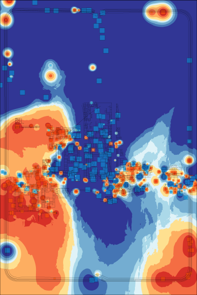
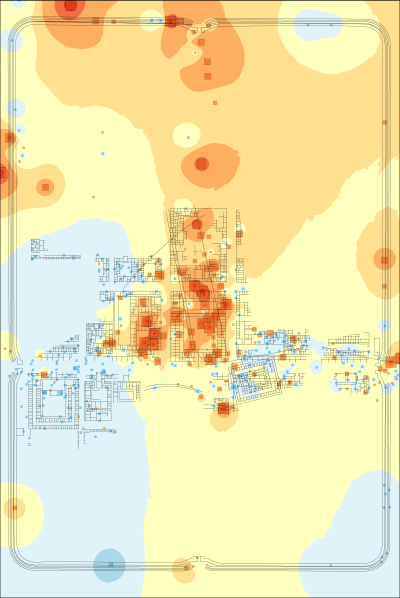
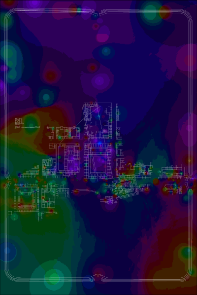
As an aid to interpretation, a further step can be taken to interpolate between the locations of the trenches on the assumption that the finds from a trench can be taken as representative of the general area in which they may have been used. An inverse-distance-weighted interpolation was used on the trench centroids with the axis values used as Z-values (the weighting of the interpolation) and number of points set to 50. This created raster layers of interpolated values for axis 1 and axis 2 (layers could be created for each axis of the CA if desired). As discussed above with relation to one-dimensional data, these can be displayed with a divergent colour scheme (Figure 7 and Figure 8). Combining two axes is also possible with the preferred use of an HSV colour model requiring a transformation of raster values from Cartesian to Polar coordinates (creating a Φ raster with values 0-360 and an r raster scaled to values of 0-100). These raster values can then be combined to form a single image (Figure 9) which is the correlate of the point distribution (Figure 5).
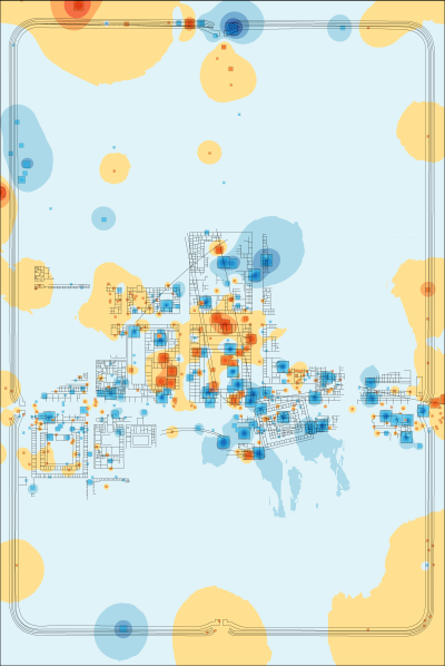
In both the interpolation of the first and second axis, we can see again the distinctive signature of the central buildings vs the more peripheral buildings within the fortress. There is also a second spatial structure visible on the first axis with consistently positive values in the western buildings and south-east corner of the fortress. This is more apparent in the combined HSV interpolation in which the central buildings are green (negative first axis, positive second axis), the eastern buildings tend to dark orange (negative first axis, negative second axis) and the western buildings to dark blue (positive first axis, positive second axis).
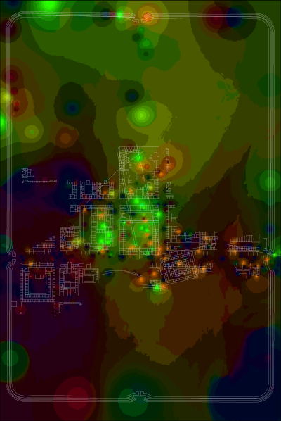
From this analysis, although we have only plotted fabric types, we can perhaps suggest how different parts of the fortress, or different status groups, may have tended towards different types of food-related activities and begin to identify a spatial structure in the data that could be investigated further. We can divide the buildings into zones that have the potential to reflect different patterns of practice and consumption, with the principia and 'senior officers' houses' in the centre, the building to the south-west and the street to the east as further zones. Continuing with this example, the central principia, 'senior officers' houses' and open market in front of the principia tend toward imported finewares such as the Arretine terra sigillata and non-ceramic vessels. The barracks and Neronian building to the east perhaps have more Gaulish terra sigillata and fewer vessels of utilitarian wares. The building in the south-west, the alleged valetudinarium, has higher quantities of utilitarian wares. The general pattern is of a robust spatial structure to the overall distribution.
Although inferring building and foodways patterns from the analysis is difficult, it is clear that there is spatial structuring in the dataset. If we were to use a range of categorisations (e.g. fabric, form or a combination of both), the same analysis could be re-run to identify the categorisation with the most helpful spatial structure. A second issue relates to the underlying tendency of correspondence analysis to overemphasise the importance of small assemblages and rare fabrics/forms. A resolution to this can be found in the use of the 'multispati' function of the ade4 package in R (Chessel et al. 2004; Dray and Dufour 2007) to run a spatial correspondence analysis (SCA). Multispati uses a spatial weights matrix of the locations of the samples (in this case the x and y coordinates of the trench centres) to weight a multivariate analysis by the Moran's I scores of the eigenvalues. This effectively selects combinations of variables that maximise the variance explained by spatial descriptors (Dray et al. 2008). The resulting bi-plot identifies which species (fabrics) are best correlated with the spatial distribution of trenches (i.e. has the greatest spatial auto-correlation). As an example, the same dataset has been processed using the multispati function and visualised using the same method as described above (Figures 10-12, Figure 13 [SVG]).
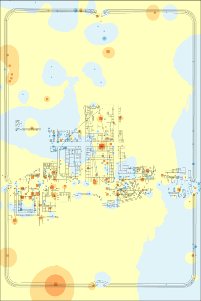
Comparing the results of the SCA with the CA, a stronger spatial structure is apparent and we can perhaps more confidently identify zoning (Figure 12) – the principia and central buildings (purple), the alleged valetudinarium and western buildings (green) and the so-called tribunes' residences (orange). This last zone was not identified by the intial CA (compare with Figure 9). Unfortunately, interpreting which wares drive this distribution is not straightforward, as we can see from the bi-plot (Figure 13 [SVG]). The first axis groups Arretine terra sigillata with Belgic terra rubra and southern Gaulish terra sigillata with Belgic terra nigra, which is essentially the result of a chronological division between the early and mid-first century CE. Earlier forts, from the Augustan period, have indeed been identified in this central area and so no doubt are partly responsible for this spatial structure (see Allison 2013, 109-33). The second axis is less easily understood, but many of the wares in the negative portion – mortaria, utilitarian wares, amphorae and Pompeian Red Ware are more suited for preparation and cooking rather than serving. However, this division is slightly different to that observed from the CA and hence implies different activities in the buildings. A fuller exploration of the different vessels and their find spots may resolve these differences. They may also relate to the quality of the original dataset, with long trenches that extended over multiple buildings (but which this analysis has reduced down to centre points). However, the spatial structure observed and the drivers of it identified from the bi-plot appear plausible. In this sense, the greatest strength of both the CA and SCA (and their spatial visualisation) is their role in exploring a dataset and understanding its underlying structures rather than producing a single final conclusion. Or, to put it another way: more analysis is necessary!
The identification of chronological change using a correspondence analysis of archaeological material should be common. This is all the more true of ceramic data (particularly Roman material), in which identifying chronological shifts or divisions has been a fundamental principle of analysis. Although this has resulted in datasets that are less suited to analyses of use and practice, it also creates the potential for detailed and reliable phasing. The second case study involves only terra sigillata forms collected as part of 'The Samian Project' (Willis 1997; 1998; 2004; 2005; 2011). The aim of this study is to demonstrate how correspondence analysis can be used explicitly to consider temporal changes in regional distributions. This new analysis described below makes use of a dataset of 179 phased ceramic groups from across Roman Britain. These range in date from 30-277 CE, and I have split the groups into three arbitrary phases based on natural breaks in the data: 40-80 CE; 80-160 CE and 160-300 CE (or early, middle and late). Although the phases are of uneven length and only loosely correlate with pre-existing archaeological or historical chronologies, they provide the best split for 'The Samian Project's' dataset, producing the fewest number of sites with assemblages overlapping the phase boundaries. Where phase overlapping was unavoidable, sites have been grouped within the phase for which they have the greatest overlap. The ceramic forms were taken directly from Willis' dataset and simplified into the categories: Beaker or Jar, Bowl or Dish, Cup, Cup or Dish, Decorated Bowl, Decorated Beaker, Platter (see Table 2, Table 3, Table 4 and Table 5 for the categorisation, raw numbers, numbers per site, and percentages). Some basic trends in the data are apparent and already known (Willis 2004; 2011). For example: 'Bowl or Dish' increases markedly over time (from an initial 6.24 per cent per ceramic group to 43.82 per cent) while 'Platter' decreases (39.13 per cent to 4.79 per cent).
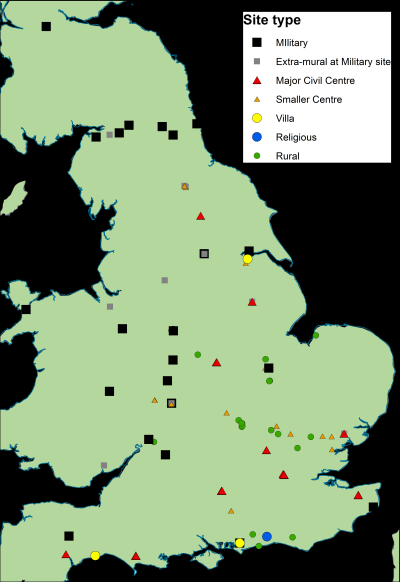
The spatial distribution of sites has good coverage, although with some clusters more evident in the south-east and along Hadrian's Wall (Figure 14). Site types are less well distributed, with military sites in the west and north, rural and small centres in the east midlands and south-east and major civil centres largely in the south. Military sites are far more heavily represented in the earlier phase, and the same is true of smaller and rural centres in the later phase. However, the overall coverage and variety of site types can be considered reasonably consistent across the three phases. The dataset is therefore suitable for considering how the use of terra sigillata varied by region and over time.
All ceramic groups were analysed together with a correspondence analysis (Figure 15 [SVG]). As expected, the first axis is dominated by the opposition of 'Platter' to 'Bowl or Dish' with the former plotting positive and the latter negative. Decorated vessels are roughly on the origin of the first axis, but 'Cups' and 'Cups or Dishes' are more positive and 'Beaker or Jar' more negative. The second axis is largely a split between decorated vessels (negative) and non-decorated vessels (positive), 'Cups or Dishes' are also negative. Considering the different site types, it is clear that assemblages from military sites tend more towards decorated vessels (Willis 2011; compare Mees this volume), and small and rural centres tend more towards undecorated vessels although all site types have wide distributions across the bi-plot.
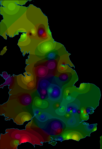
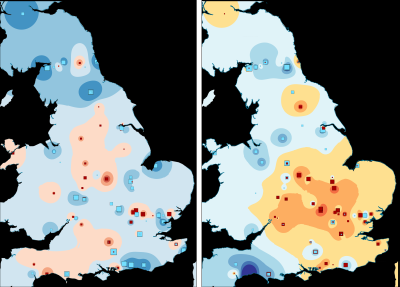
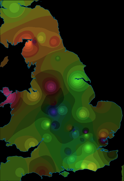
As before, we can visualise these axis values spatially (Figures 16-18). This identifies two different trends – positive and negative axis-1 values have overlapping distributions (albeit with more negative values in the north) while positive axis-2 values tend towards the north and west with negative values to the south and east. Together, these suggest that there is a strong spatial component to the results. This obscures temporal trends, except that more northern sites tend to be later in date.
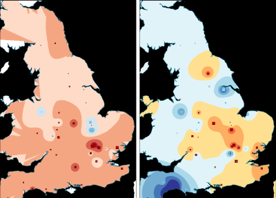
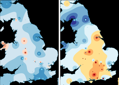
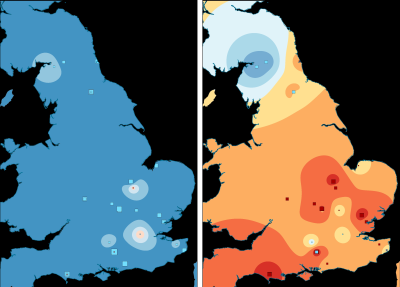
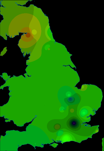
However, if we visualise the phases individually then a clearer pattern emerges. In order to enhance the visualisation, the axis values have been interpolated by phase, using only the data points of that phase (Figures 19-21, Figure 22 [SVG], Figures 23-25, Figure 26 [SVG], Figures 27-29, Figure 30 [SVG]; note that due to this phasing, the multispatial method described above (Chessel et al. 2004; Dray and Dufour 2007) should not be used as this would emphasise spatial structures across all phases simultaneously rather than by individual phase). Each phase depicts only a portion of the bi-plot, but the colour model used for both single and dual axis interpolations remains the same so that visualisations of different phases are directly comparable. As a result, it is now possible to identify some fairly strong shifts in spatial patterning. The temporal change identified in the first axis (Figure 19, Figure 23, Figure 27) is all the more evident as the interpolation shifts from positive values (characterised by platters and cups) for the early phase to negative values for the middle and late phases (characterised by 'bowl or dish'). The second axis reaffirms the link between decorated forms and the military community, with these plotting consistently in the negative part of the graph (Figures 20, 24, 28). In the early phase, this includes major centres such as Lincoln, Exeter and St Albans, but also nearby sites such as Dragonby. The combined axis plots (Figure 21, Figure 25, Figure 29) give a sense of change over time in overall assemblage composition, but also shifting groups with a military community most apparent (pinks shifting to orange) and an increasingly visible rural community (greens) while the assemblages from urban centres remain highly varied.
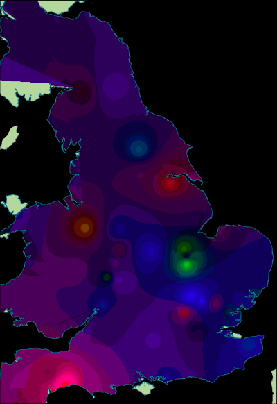
The visualisation is not without its drawbacks. Visual artefacts are more evident in these figures, and the interpolation especially cannot be used to predict the characteristics of sites not included in the analysis (due to the volatility in the dataset, and the range of factors beyond spatial location). However, the results are very effective in communicating the patterns suggested by Willis (2004; 2011) through better visualisation of the complexities in the data. Furthermore, the analysis demonstrates that temporal changes in ceramic consumption was not uniform across Roman Britain, and that ceramics more commonly associated with the military communities were not confined solely to military sites. These may be 'common-sense' interpretations, but nonetheless they are difficult to demonstrate using more conventional graph types.
Correspondence analysis has been used for analysing a wide array of categorical data (i.e. divided on the basis of a qualitative property), including archaeobotanical, faunal, ceramic, glass and small finds. Provided that there is consistency in the data collection and recording methodologies, there is no reason that such data cannot also be visualised spatially (see Sterry 2010 for an early iteration of this spatial correspondence analysis applied to fieldwalking scatters). However, this form of analysis requires both rich, high-quality datasets and good spatial coverage to be effective. The two case studies here use respectively 520 and 179 different assemblages, yet both partly suffer from poor spatial coverage as a consequence of the original data collection methods employed that Willis (2004) and Allison (2013) were obliged to draw upon.
The use of such a broad spectrum of colours in the visualisations will be less effective for some viewers, especially for those with colour vision deficiencies. Even for those without, the HSV colour wheel is far from perfect. It is easy to use for image editing, but quite poor at representing the spectrum of human vision as the colours are not evenly distributed and the primaries (red, green, blue in the HSV colour wheel) do not have the same lightness. This makes it harder to intuitively assess similarity and difference between colours satisfactorily. Similar problems exist when the plots are viewed through different media – screen, projection and print. One option would be to use a different colour model, for example, the Munsell chart (or CIELAB as discussed earlier); however, these are all more computationally complicated to translate. Not only would this make the visualisation more time-consuming to produce, but it would also create issues for some viewers as it would be less clear how the visualisation was created from the data and therefore whether it was still a valid representation. The scaling of the bi-plot is also an issue, in this article the first axis and second axis scores have not been standardised or otherwise adjusted. There is potential to vary this scaling; axis values could be weighted by the inertia of the axis to better incorporate the different variance as explained by the first and second axes. Similarly, Value (of HSV) on the combined plots has been scaled with 0 at the origin and 100 scaled to the most distant point. Changing this scaling either by moving 100 closer to 0 (and treating all values more distant as 100) or by using a nonlinear scale (e.g. logarithmic) would be an effective method of reducing the effect of outliers and emphasising the spatial structure of datapoints that plot closer to 0.
The method of interpolation is also open to debate in terms of the different strengths of inverse-distance-weighting, trend-surface analysis, kriging (Gaussian process regression) etc. In the examples I have provided, I have interpolated and visualised across a Cartesian plane on the basis that physical proximity should normally correlate with similarity of assemblage (Tobler's first law of geography – 'everything is related to everything else, but near things are more related than distant things' Tobler 1970, 236). Measuring distance is potentially problematic at regional and inter-regional scales, however. Barriers such as rivers and seas should be accounted for, although this significantly increases the computational load of the analysis and creates uncertainty over matters such as the location of river crossings in antiquity. Furthermore, it may be more valid to adapt this method to work based on ease of movement across space or even within a network (see especially the work of Van Oyen (2015) on conceptualising the flow of Roman ceramics between sites).
The two case studies considered here draw attention to the vital role that space plays in the composition of archaeological assemblages, whether at the intra-site, regional or inter-regional level. As such, it seems important to incorporate the spatial component into our analyses and recognise not only that we are distinguishing between different types of assemblages, but also different locations at multiple, varying scales. The technique demonstrated in this article presents one method for addressing this.
Internet Archaeology is an open access journal based in the Department of Archaeology, University of York. Except where otherwise noted, content from this work may be used under the terms of the Creative Commons Attribution 3.0 (CC BY) Unported licence, which permits unrestricted use, distribution, and reproduction in any medium, provided that attribution to the author(s), the title of the work, the Internet Archaeology journal and the relevant URL/DOI are given.
Terms and Conditions | Legal Statements | Privacy Policy | Cookies Policy | Citing Internet Archaeology
Internet Archaeology content is preserved for the long term with the Archaeology Data Service. Help sustain and support open access publication by donating to our Open Access Archaeology Fund.