Using the data gathered by ArchAIDE, along with the data analysis, the Mappa Lab at the University of Pisa was able to apply data visualisation techniques. Data visualisation is of extreme importance to:
Data visualisation principles and good practices were followed, starting from the classification of data into types (categorical, ordinal, interval, ratio types) when imported into the programming platform. For each visualisation provided, it was determined which visual attribute represented the data types most effectively. The data visualisation component was integrated into the Desktop front-end. The data visualisation and data exploration modules show the data in different ways, with a lateral panel allowing users to add/remove different layers of data and/or tools.
The Reference Database contains basic visualisation and exploration tools; for example when viewing a stamp or a pottery type, a location map is available. In addition, for every location, it is possible to explore which and how many different stamps/types were found there. By interactively querying the tables, it is possible to switch from selected stamps to corresponding types and vice versa. By selecting a time interval, it is possible to visualise the map of types or stamps found in that specific timeframe. The online viewer for the 3D models of the pottery types was built using the 3DHOP tool, an open-source framework for the interactive visualisation of 3D models online. By using HTML5 and WebGL it is possible to display interactive 3D without plug-ins on almost all desktop and mobile platforms. The viewer uses a simple turntable navigation that lets the user inspect in detail the whole geometry of the pottery, measure the 3D model, change lighting, and activate a cut-through section that shows the profile of the vessel with respect to the whole shape (see Figure 7).
To visualise pottery networks, clustering, and related data, the desk front-end was implemented using OpenStreetMap (OpenStreetMap 2018) and Leaflet JavaScript mapping library (Leaflet 2018), allowing simplification of the data visualisation and thematic mapping, and making it easier to turn data into compelling maps. In particular, for the visualisation of geographic networks, the DVF Leaflet plug-in was used, which is an open-source JavaScript extension of Leaflet, allowing the creation of very complex interactive thematic mappings.
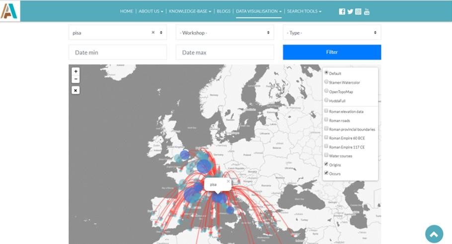
The origin-occurrences map displays all the locations. Clicking on a location produces lines going to and from the point of origin and where the type is found (in different colours), as well as activating a pop-up containing descriptive information. This information can be organised as summary statistics for that particular location (about stamps and/or types, number of incoming and outgoing sherds, latitude and longitude, name of location), that can be navigated in order to gain more information. In addition, through the side menu, different locations can be selected and added to the network and kept 'fixed' within the network visualisation (Figure 15).
One layer of visualisation will mark locations with circles of a size proportional to the sum of incoming and outgoing sherds, while the proportion of incoming versus outgoing sherds are shown in blue and red. Additional queries can compute the PageRank of the network, or can 'colour' the locations according to the different workshops associated with a pottery type. To represent time, and therefore chronology, by clicking on a location, it is possible to see the 'history' of the exports/imports using an area graph. A separate tool can also generate an animation, based on time flow, with arrows and locations being formed and disappearing as time passes. For computational reasons, clustering of the graph can be made available only for a certain number of fixed choices, including the whole network and the networks identified by the four temporal intervals computed by the algorithm (described in Section 3).
Internet Archaeology is an open access journal based in the Department of Archaeology, University of York. Except where otherwise noted, content from this work may be used under the terms of the Creative Commons Attribution 3.0 (CC BY) Unported licence, which permits unrestricted use, distribution, and reproduction in any medium, provided that attribution to the author(s), the title of the work, the Internet Archaeology journal and the relevant URL/DOI are given.
Terms and Conditions | Legal Statements | Privacy Policy | Cookies Policy | Citing Internet Archaeology
Internet Archaeology content is preserved for the long term with the Archaeology Data Service (ROR). Help sustain and support open access publication by donating to our Open Access Archaeology Fund.